

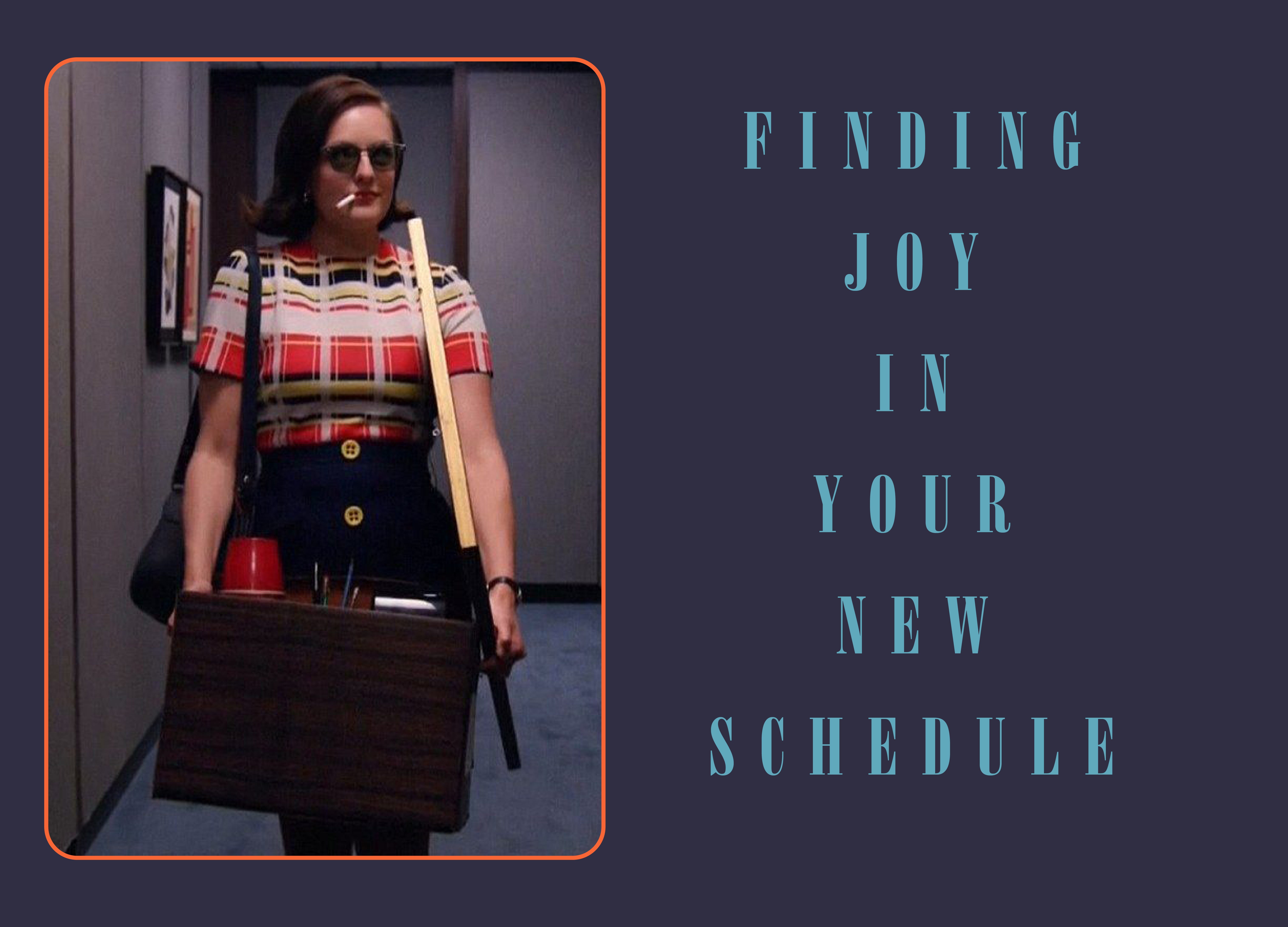
This & That: Mad Men Edition
What’s inspiring me while rewatching Mad Men for the 20th time

I’m currently deep into a Mad Men rewatch with my husband. And when I say rewatch, I mean I’ve seen the show more times than I care to admit. With the series moving to HBO and the controversy around previously unedited scenes being uploaded, the show has somehow become even more fun to watch, especially when it comes to spotting Easter eggs hidden in plain sight.
My first real job was as a casting assistant, and my bosses, Beth Bowling and Kim Miscia, were responsible for casting the original Mad Men ensemble. At the time, it was already the biggest show, but I had not started watching yet. I wish I could go back and ask them questions, or restudy the audition tapes I once saw, including a baby Jon Hamm. It would not be until years later that I finally watched, became obsessed, and felt the need to study every single scene.
Everything I’ve been looking at this week has been filtered through Mad Men, and these are a few of the things that inspired this week’s letter.
Do you have your fingers in your ears? It’s a Chip ‘n Dip!
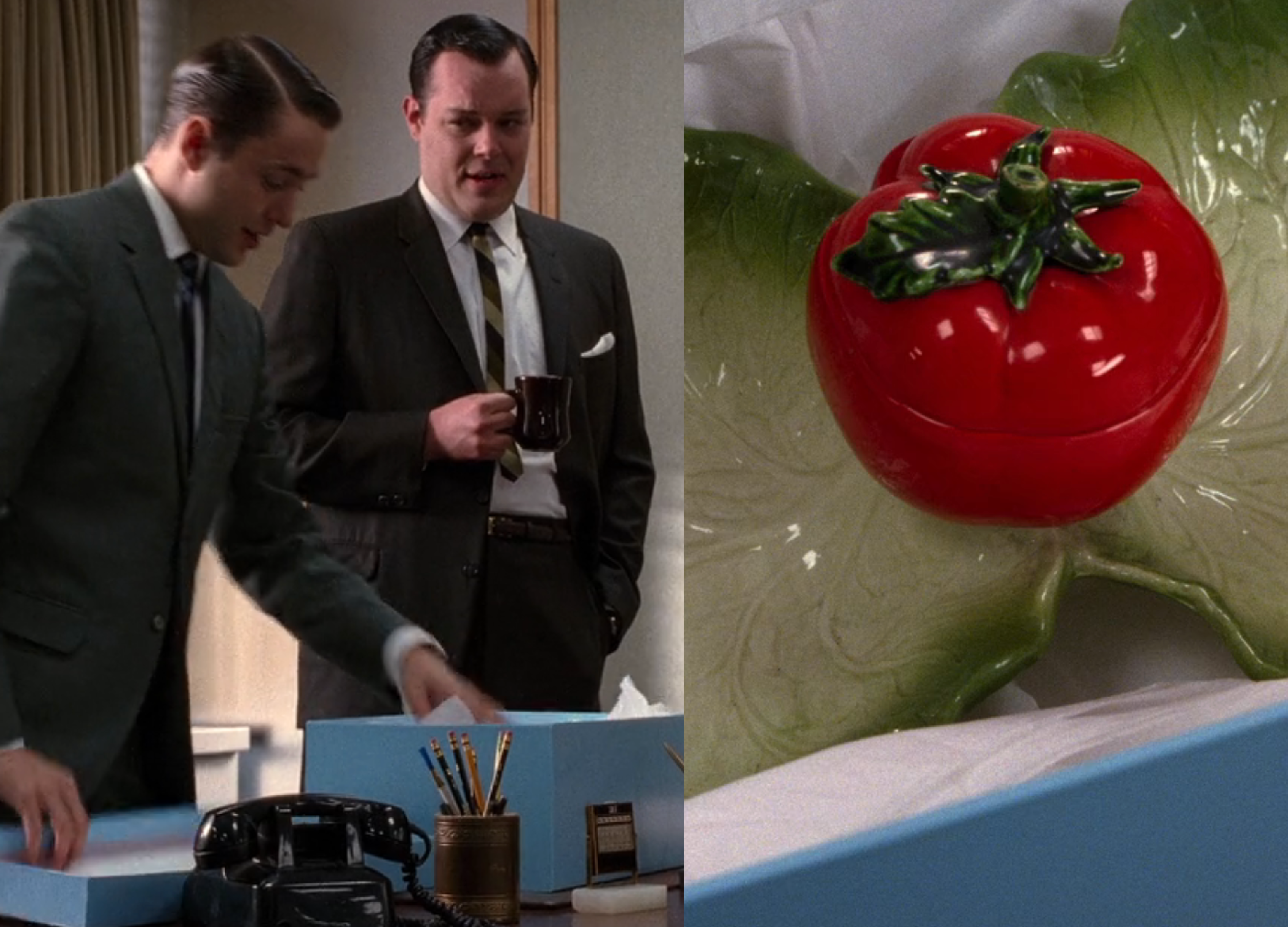
I might be the only one who gets a kick out of the fact that Pete Campbell says “chip and dip” eight-plus times while describing a duplicate wedding gift he received. It is clearly the butt of the joke, but that whole style of dinnerware has been quietly piquing my interest lately. I love the idea of adding a few whimsical pieces to brighten a spread.
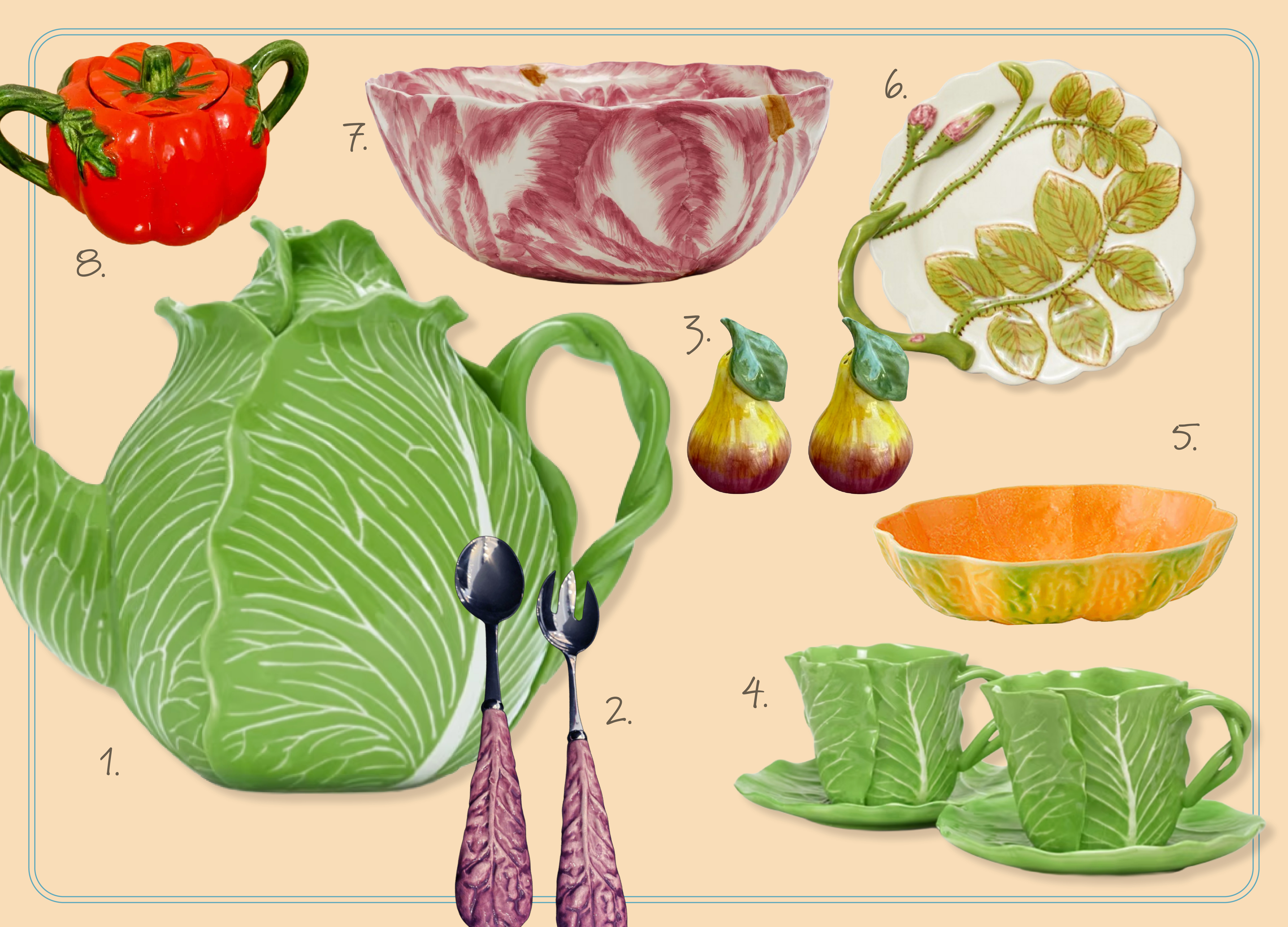
Over the weekend at ABC Carpet and Home, I spotted a beautiful asparagus plate that sent me down a rabbit hole on the origins of these vegetal designs.


Cabbageware’s has origins dating back to the 18th-century Europe, when nature inspired ceramics first was adapted. The look was further popularized in the 19th century by Portugal’s Bordallo Pinheiro, and then experienced a major American revival in the 1960s thanks to Dodie Thayer, the “Pottery Queen of Palm Beach.” Her hand-molded “lettuce ware,” collected by icons like Jackie Kennedy Onassis, cemented the style as a timeless, much-coveted collectible and is currently a collaboration with Tory Burch. Below are a mix of my favorite versions to live out your Pete Campbell party fantasy.

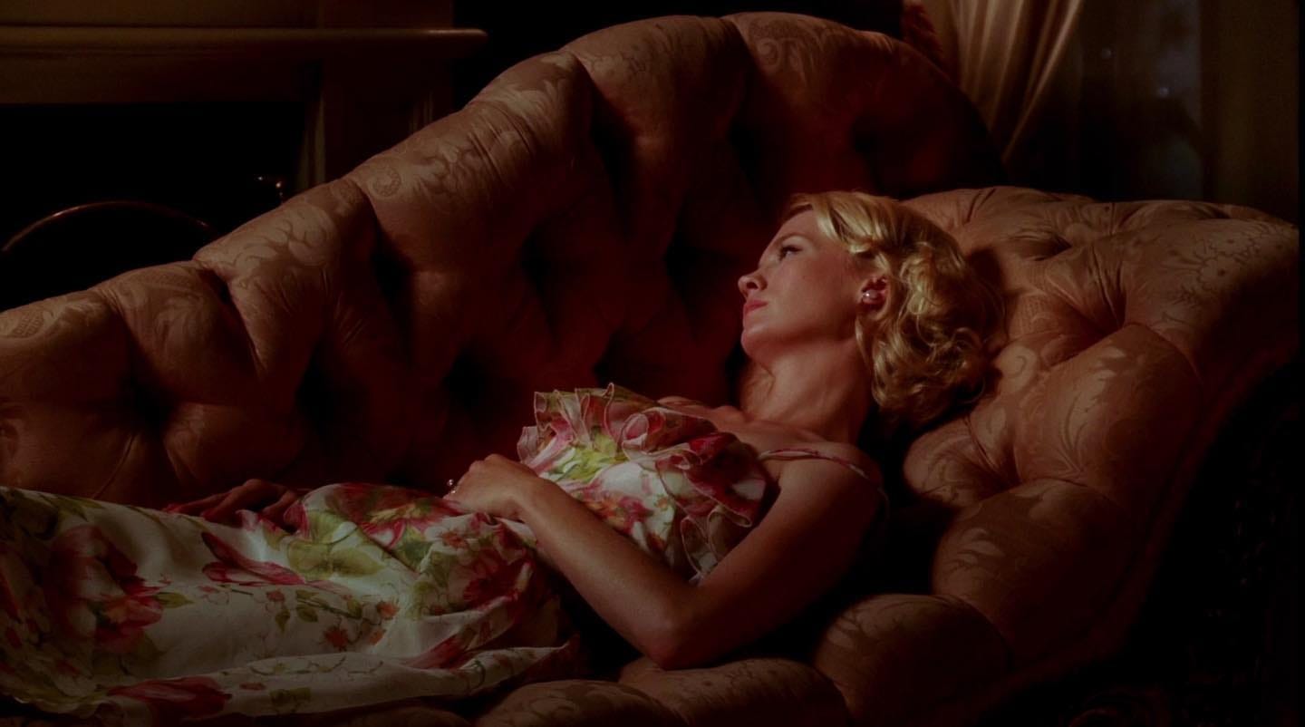
One of the most iconic interior design moments in Mad Men comes when Betty works closely with a modern interior designer to update the living room. It happens as she is quietly falling for Henry Francis, who comments on how beautiful she would look on a fainting couch they pass in a store window. She buys it and places it directly in the center of her newly styled room.
It does not belong there. Oversized and tufted, it interrupts the space and feels almost confrontational. A piece of furniture that refuses to blend in, mirroring Betty’s growing want to not fit with Don.
The fainting couch carries its own mythology. It is often associated with Victorian women and restrictive corsets, though the term itself is modern. At the time, it would have been called a daybed, part of a long tradition of Greek and Roman lounging furniture revived as fashion.
I would never be able to fit one in my apartment, but if I could, these are the ones I would consider.


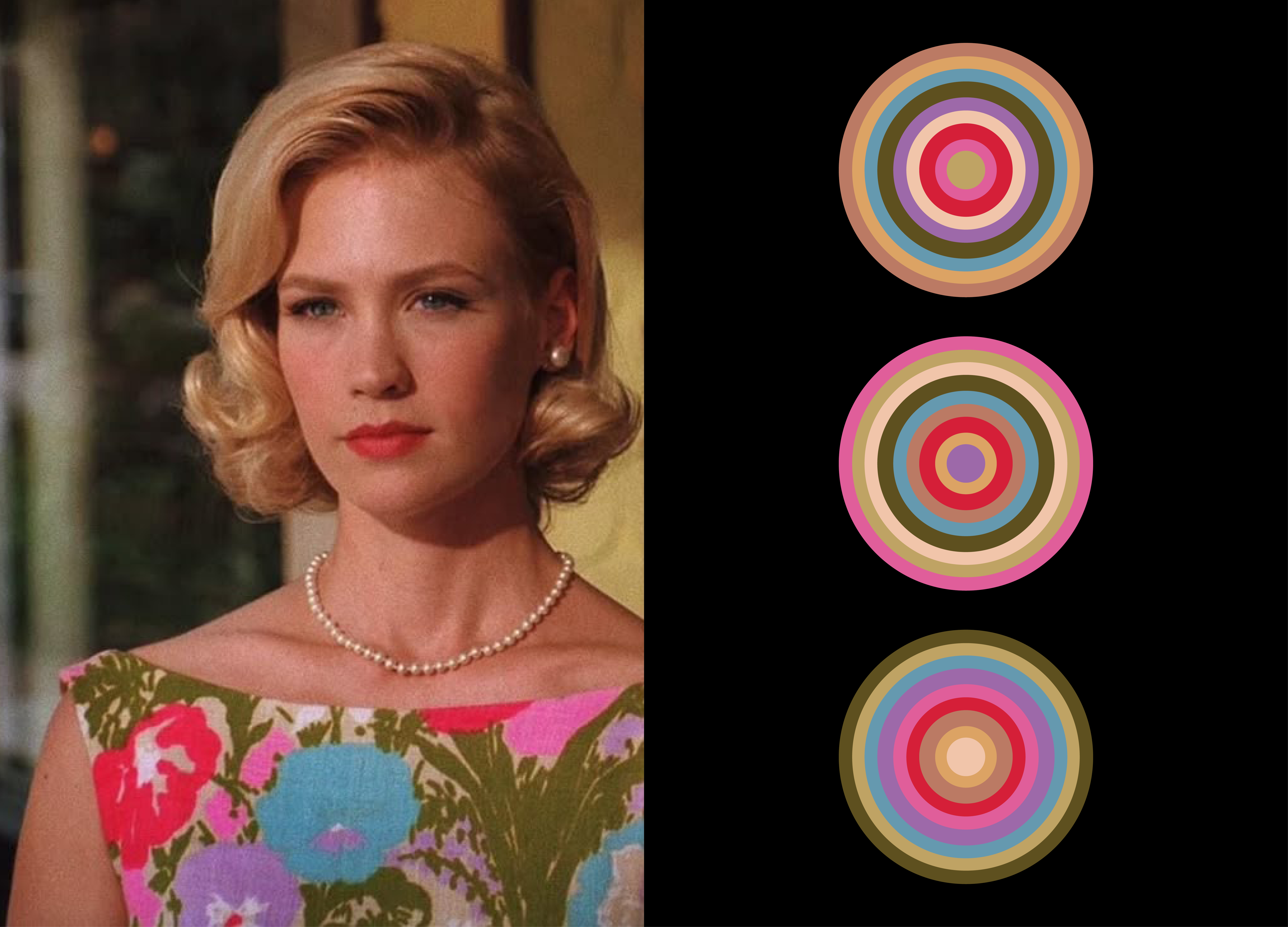
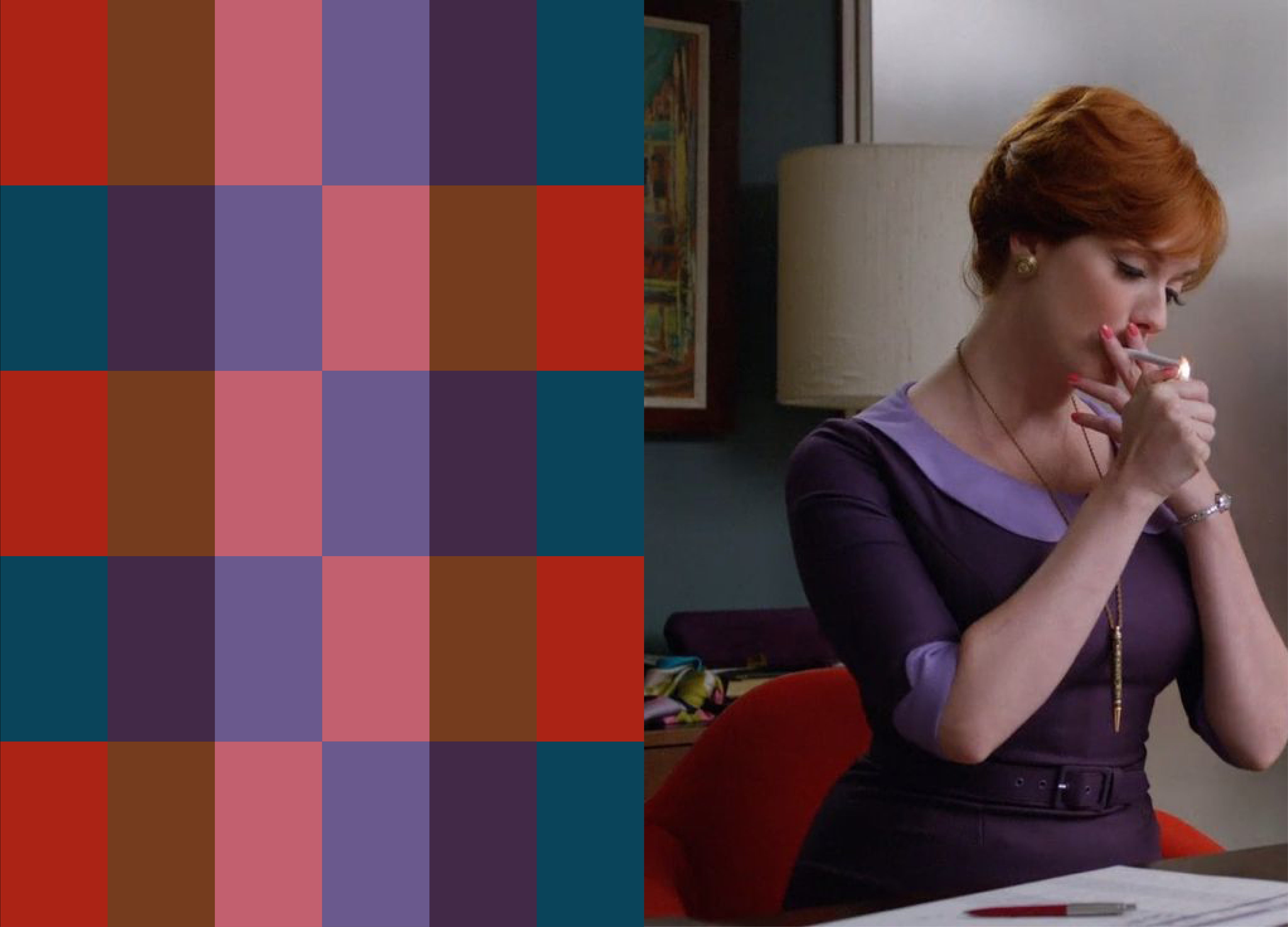
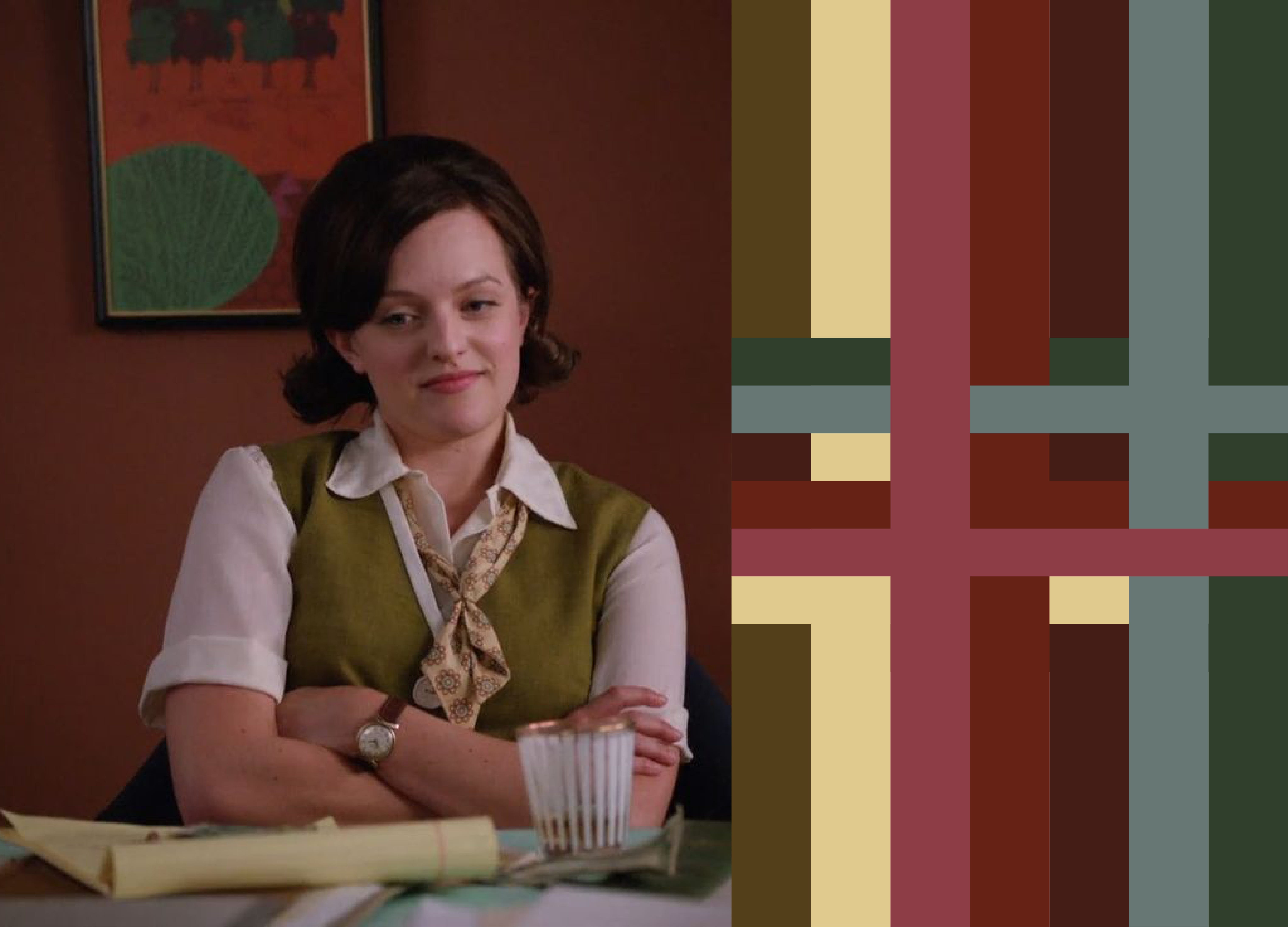
Color in great movies and television tells a story, reflecting a character’s inner state, broader societal shifts, and thematic depth. I wanted to pull a few stills and look more closely at the colors used across the show’s three heroines. Whether jewel tones, bright pastels, or muted shades, they are all beautiful and consistently inspiring when I am working through projects.

In graphic design classes, discussions of 1960s design often centered on Paul Rand, Saul Bass, and Milton Glaser. There were many other figures doing influential, elegant work who went largely unrecognized, and one of them was Georg Olden. Beginning his career at CBS, he helped define the visual language of early television, creating on-air graphics, logos, and title cards that balanced clarity with modern restraint.
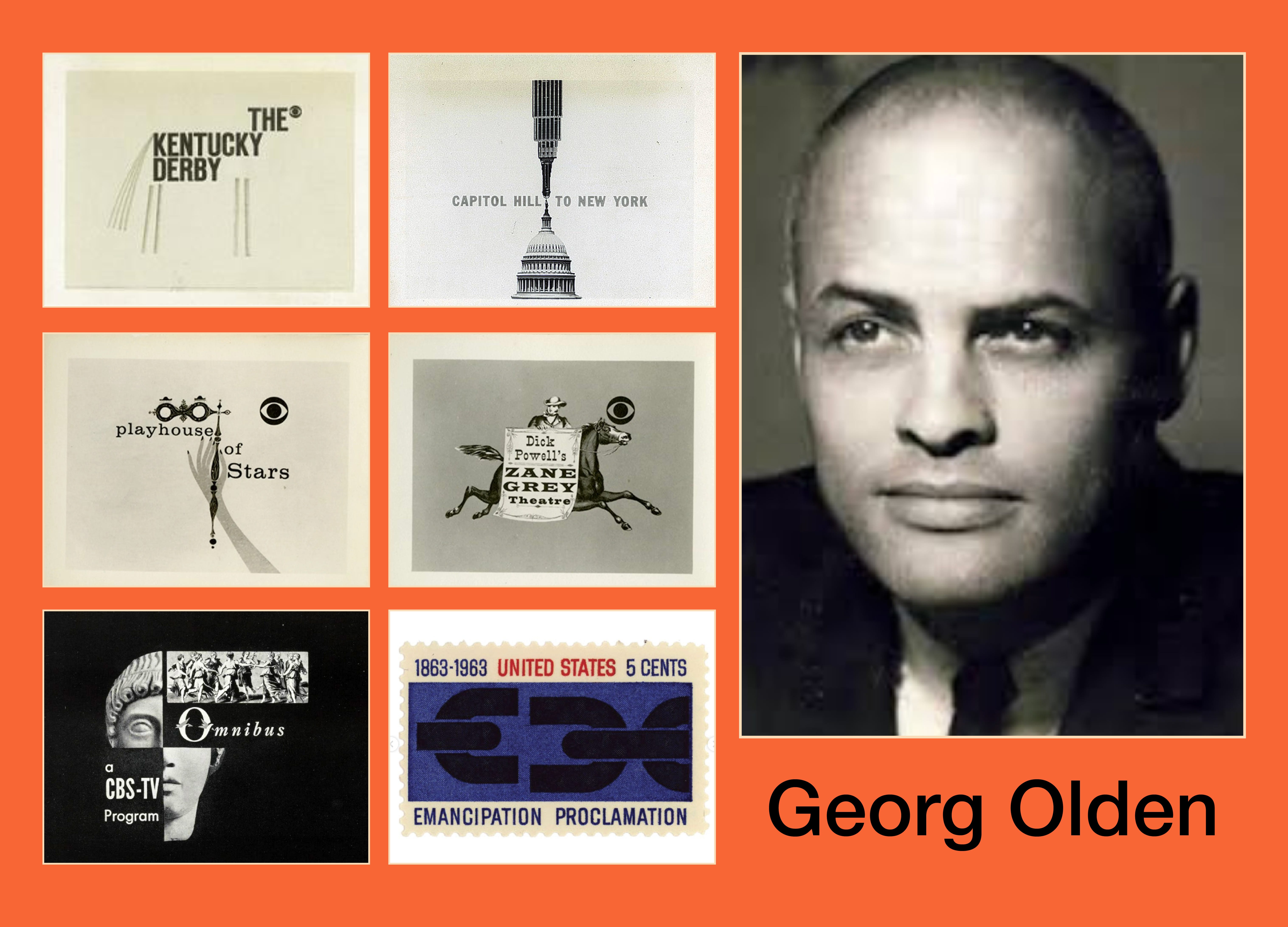
He later became the first Black art director at BBDO and went on to serve as a senior art director at McCann, contributing to major national advertising campaigns during a period when American visual culture was rapidly evolving. His design of the Emancipation postage stamp stands as a national symbol rendered with restraint and dignity. The beauty and influence of the work, and the difficulty of the world in which it was made, sit side by side. Across media and institutions, Olden’s work reflects a designer deeply attuned to symbolism, balance, and the quiet authority of good design.

As I wrap up this week’s letter, I find myself reflecting on the year and a half mark of freelancing. One of the most important lessons has been the value of small acts that disrupt the normal nine to five rhythm. They create space for autonomy and for choosing what genuinely supports you.


Going to the farmers market each week has become my quiet rebellion in this new freelance existence. It happens during my former nine to five and is blocked on my calendar. It is a reminder that my health and what I put in my body matter more than what I do for work. I make up the time elsewhere.
It feels like a small celebration of a new framework, and I am learning that honoring it is an important part of the process.
Thank you so much for reading. If you enjoyed this, please like and subscribe. It truly helps as I continue growing this little letter.
This was a nice read. My husband and I just finished our rewatch, too. It just made me want to do my whole living room like Joan’s apartment.
Such a fun read! I love thinking about all of the work, the references, the design and colors that go into making these shows.