

Presentation design is not boring.
We all have to sell ourselves or our work. 3 things to make it better.

When I hear presentation design, at least for me, I think of something that is kind of boring or tedious. I also think it has a bad PR team. Of course, there is the worst version of it: a boss asking you to move a picture one click to the right at 1 a.m. before a big meeting the next morning. But like most things, there is a dark side and a light side.
We all have to build decks, and whole industries are built on presentations to sell ideas. At some point in life, everyone ends up arranging thoughts across a sequence of 16:9 slides to share ideas with other people and hopefully win them over.
I think there is a romance to a good presentation, almost a film-like quality. A strong presentation does not just explain something, it unfolds. In my experience, a good one can sell an idea within the first few spreads, sometimes before anything is even said out loud. These are a few things I have learned after building what feels like millions of pitch presentations, along with a few layouts I mocked up to illustrate the points.

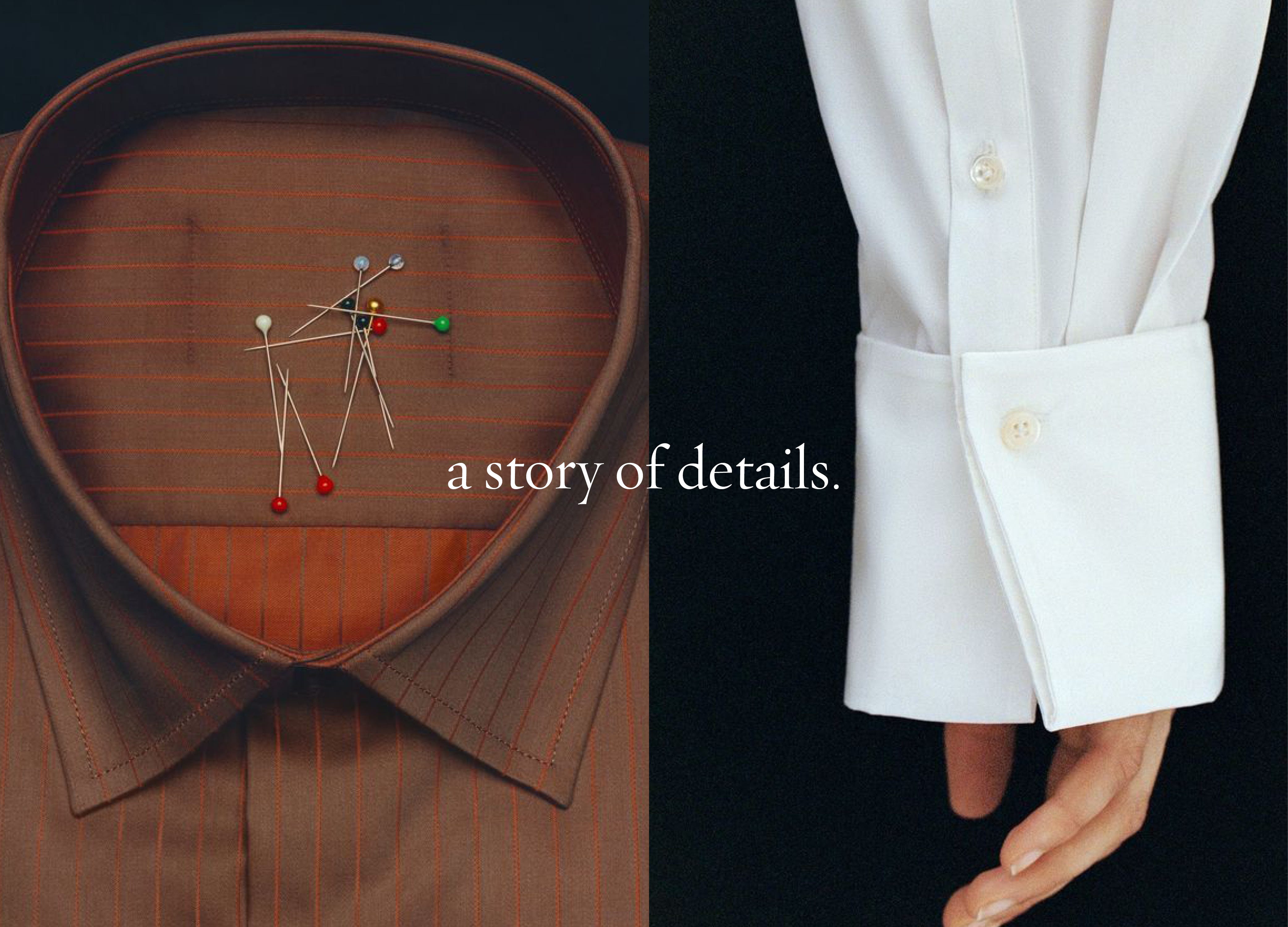
Each page sets up the next, especially at the beginning of a pitch. Some slides exist to create tension, some to slow things down, and some to land the point. When the pacing is right, the person viewing is hanging on each layout, waiting for what comes next.
An outline is essential for me. It is always very rough, just boiling things down to what is most important and making sure that is the focus. I usually think of the first three to five slides as the story of the presentation. They are the preview to the movie. After that, I get into more detail. You have to reel in the fish before you catch it.
This is a design principle and a life principle, but it is especially important in this medium. If someone sitting across the room cannot understand the high-level point of a slide without explanation, the slide is doing too much. Most people stop reading after the first few sentences anyway, if they even get past the first line.
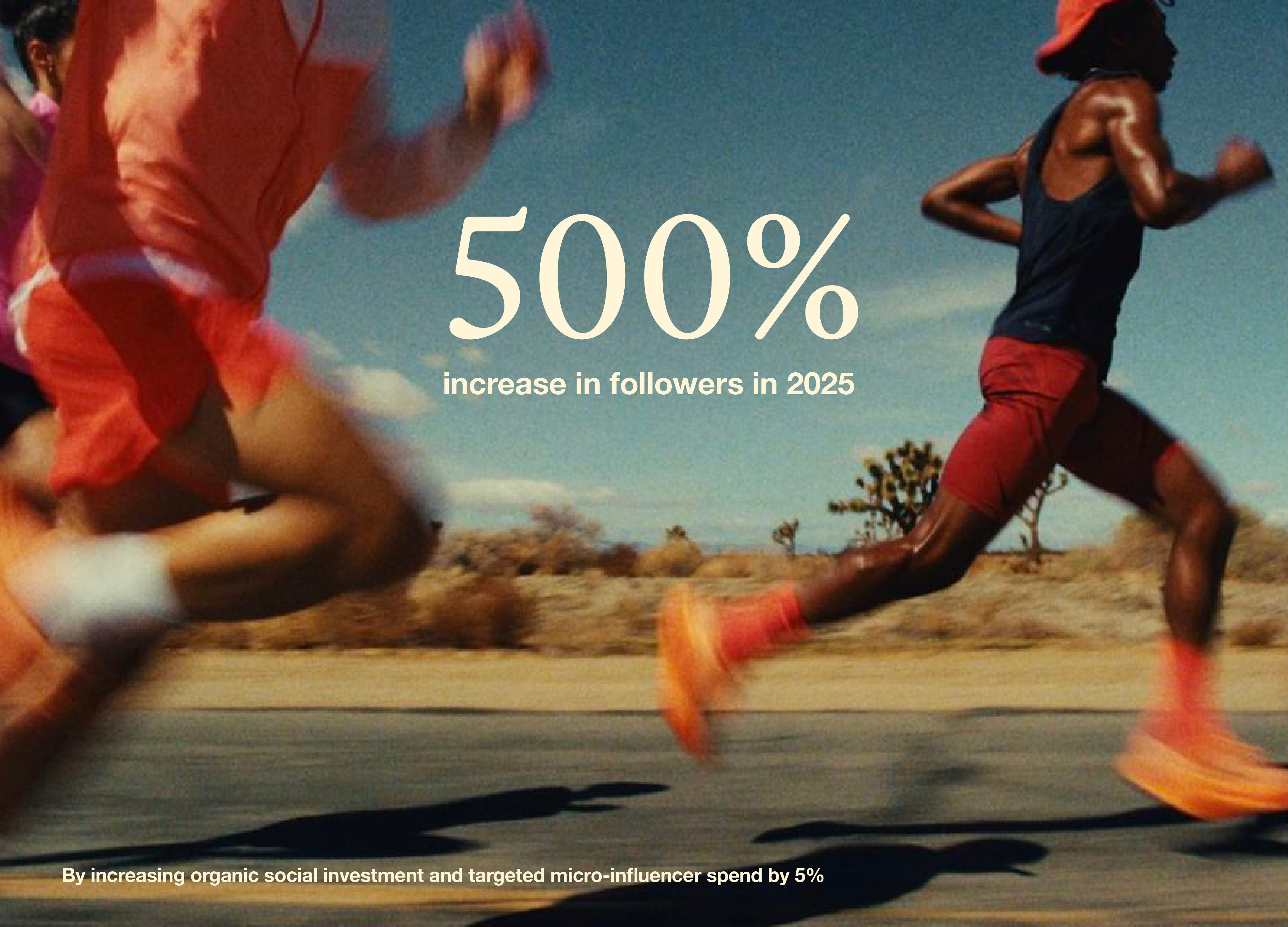
Appendix pages are there for a reason. If you need to share detail, data, or proof points, put them at the end so people can reference them at their leisure. The main deck should stay focused. A few strong sentences on a page communicate confidence and clarity. Killing images, copy, or half-relevant stats can be the difference between people focusing on the painstaking work you have done and thinking about their grocery list as they mentally check out.
I always ask myself: if there is one thing I hope someone gets from this slide, what is it? Anything secondary should live in a caption, the appendix, or in my notes to speak to.


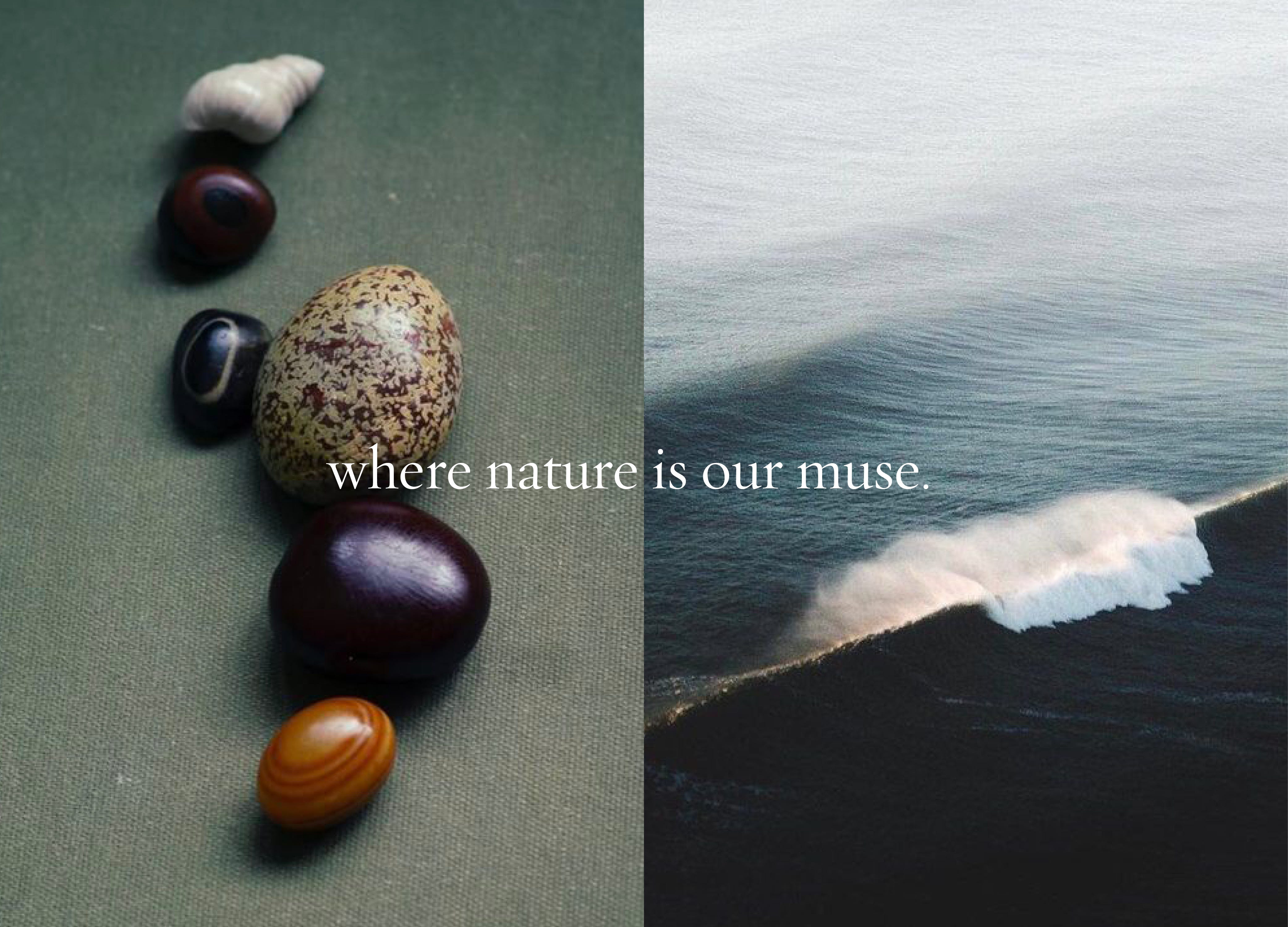
Strip away the features, the metrics, and the jargon, and you are left with something basic and human. Stories we can all resonate with. Community. Ritual. Escapism. Craftsmanship. Nature.
Building a hook around something human gives the presentation a voice. When we stick to that, a lot of the heavy lifting is done for us. Complex things can be simplified, and I think generally when we are simple, we are clear, and that is a winning combination.
I know not all presentations have the luxury of spreading ideas across multiple slides, or a client who wants to cram four pages of figures onto one page. But sprinkling these principles in where you can makes a difference.
Presentation design does not have to just be a nuisance you are just getting through. It is one of the clearest ways we share ideas with each other. When it works, it does not feel like a deck at all. It feels like a story being told in real time.
Thank you so much for reading my little letter. It helps so much when you like, subscribe, and share it with others.
If you are in need of help crafting a pitch presentation, I still do a bit of consulting in this world and am currently booking for March. Always feel free to drop me a line.
I have been selling online for many years but as I age I find myself explaining more and sharing lots of details. This helps me take a new look at that. Hopefully I will be able to simplify! I love the way you explained the human hook sense of things! Thanks for this!
Molly, I now have such a clear understanding of the work you do for so many prestigious companies and organizations. You don't make the process sound tedious at all, but rather an important and creative first step in a successful presentation.