

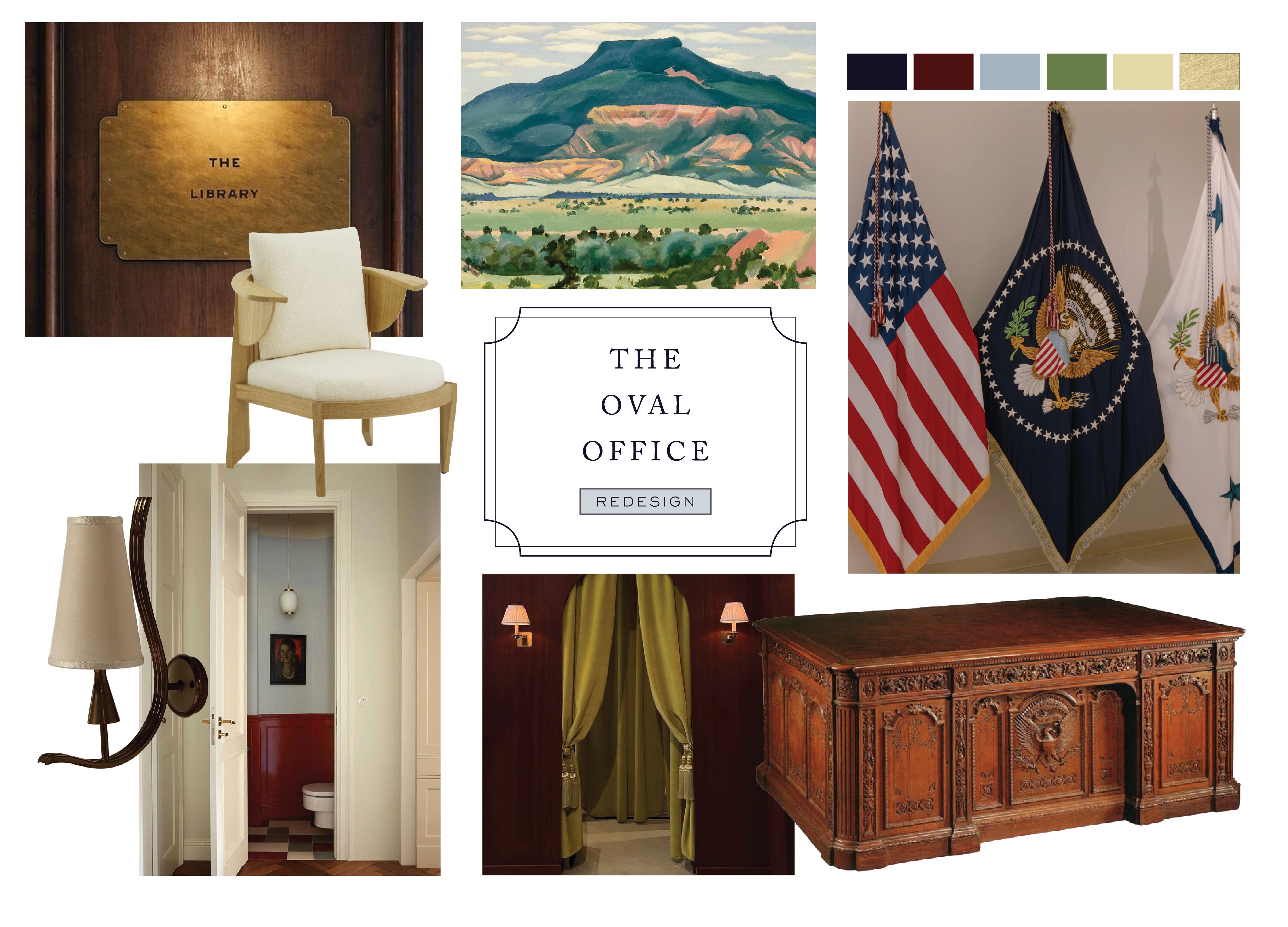
Redesigning the Oval Office
While Wishing We Lived in a Trump-Free Timeline

I have been a political junkie for as long as I can remember. Picture a high school senior in a John Kerry T-shirt and Birkenstocks, roaming a conservative school where being called a communist before first period was essentially routine. I followed every campaign, debate, and scandal, but somehow ignored the physical stage where so much of American politics actually plays out: the design of the White House.
And once I finally started paying attention… I couldn’t unsee it.
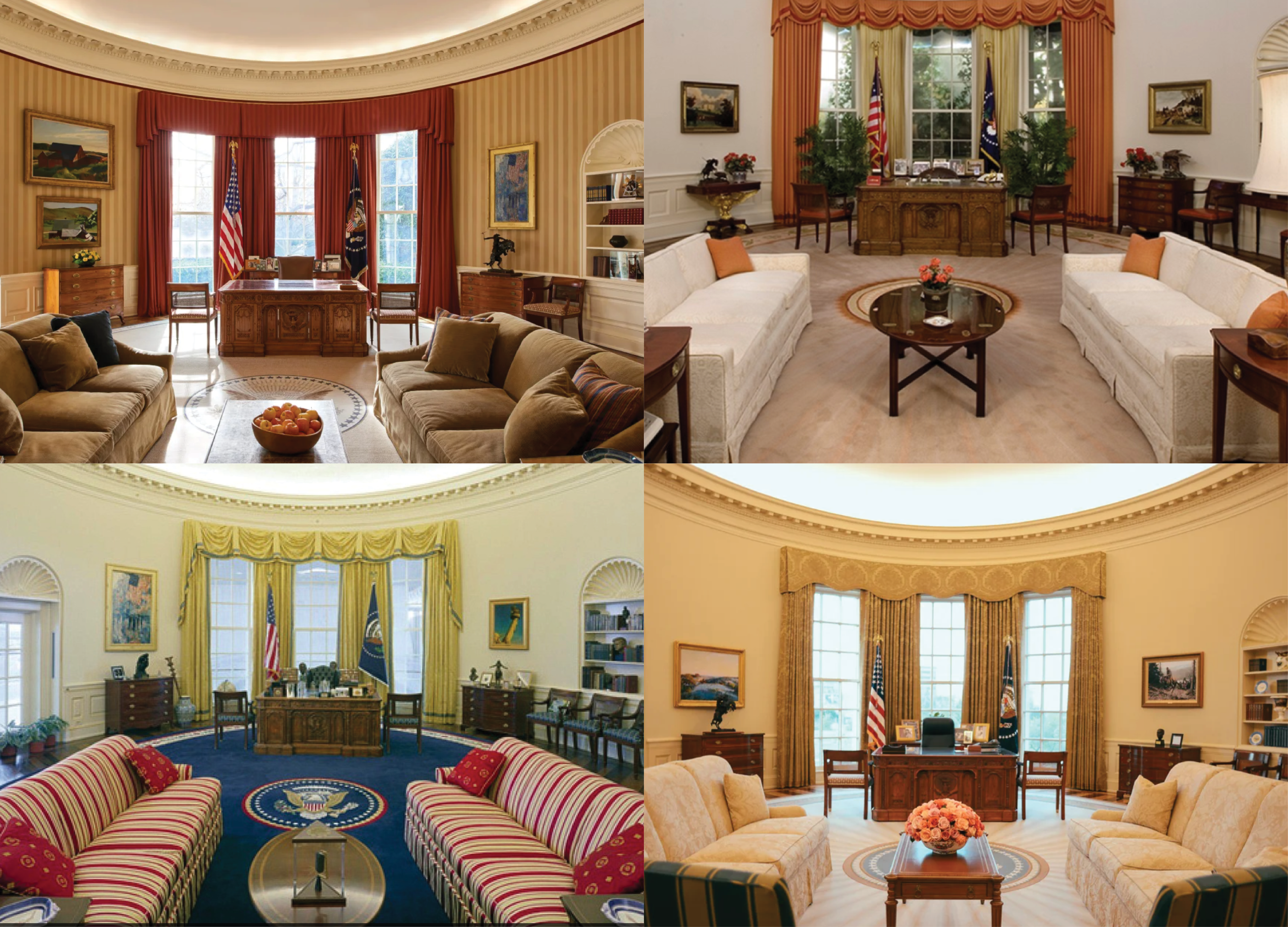
THE OVAL OFFICE OF TODAY
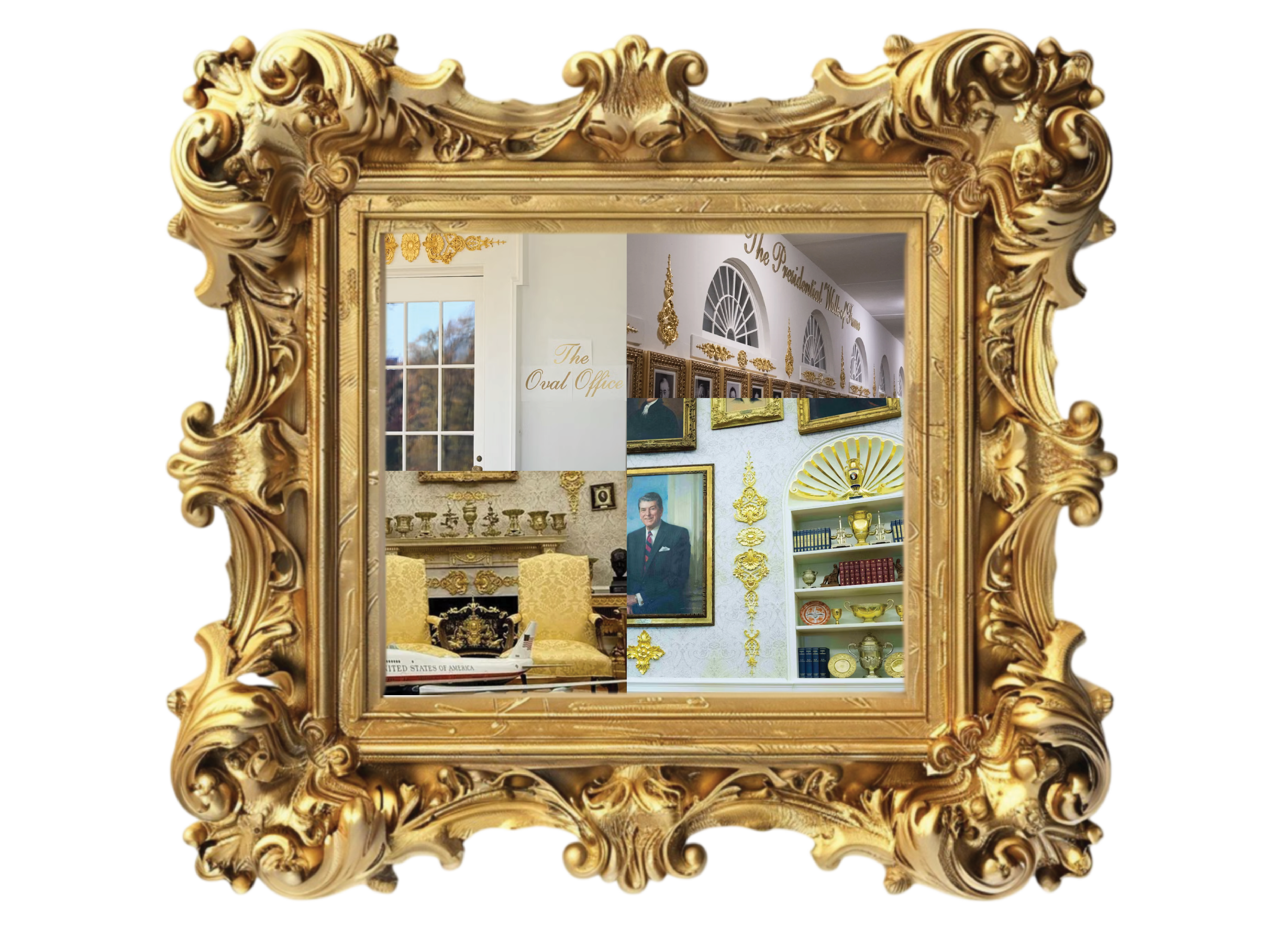
Watching this current administration operate inside this version of the Oval Office has made it impossible to look away. Previous administrations left the room feeling stuffy or outdated or a bit like a museum display, but this is something entirely different. The space now looks like it has been dipped in a vat of discount gold spray paint and decoration, the kind you would find in an aisle of Home Depot. Every surface seems to shout for attention. There is trim on top of trim. Gold piled onto more gold, as if subtlety were forbidden. It is not just gaudy. It is overwhelming, anxious, and strangely insecure, turning one of the most symbolically important rooms in the world into a stage set for a reality show about opulence. What used to be merely behind the times is now a full sensory assault, a room so saturated in metallic sheen that it practically reflects its own confusion back at you.
But here is the thing. Being revolted by bad design does not rebuild anything. Hatred, no matter how justified, does not restore or reinterpret or reimagine. So instead of fixating on the stomach-turning choices that keep lowering the floor of my aesthetic tolerance, I decided to redirect that energy into something more constructive: avoidance through reinvention. If I were to redesign one of the most iconic rooms in the world, a room that carries centuries of symbolic weight, how could I tell the story of our history through objects and materials worth preserving while also creating a space that feels modern, intentional, and not trapped in this faux gilded fever dream?
That question became my guide.
THE DESIGN PHILOSOPHY
The Oval Office does not need to be frozen in tradition to feel respectful, and it certainly does not need to be shellacked in gold to feel powerful. The best rooms are layered. They borrow from multiple eras. They acknowledge history without becoming trapped by it. America is the same way, a layered country with countless influences and decades to reflect on.
So this redesign draws from that same philosophy. A blend of periods, textures, symbolism, and modern clarity that feels deeply American without being literal.
Here is how I would rebuild the Oval Office, piece by piece.
THE TEN DESIGN ELEMENTS
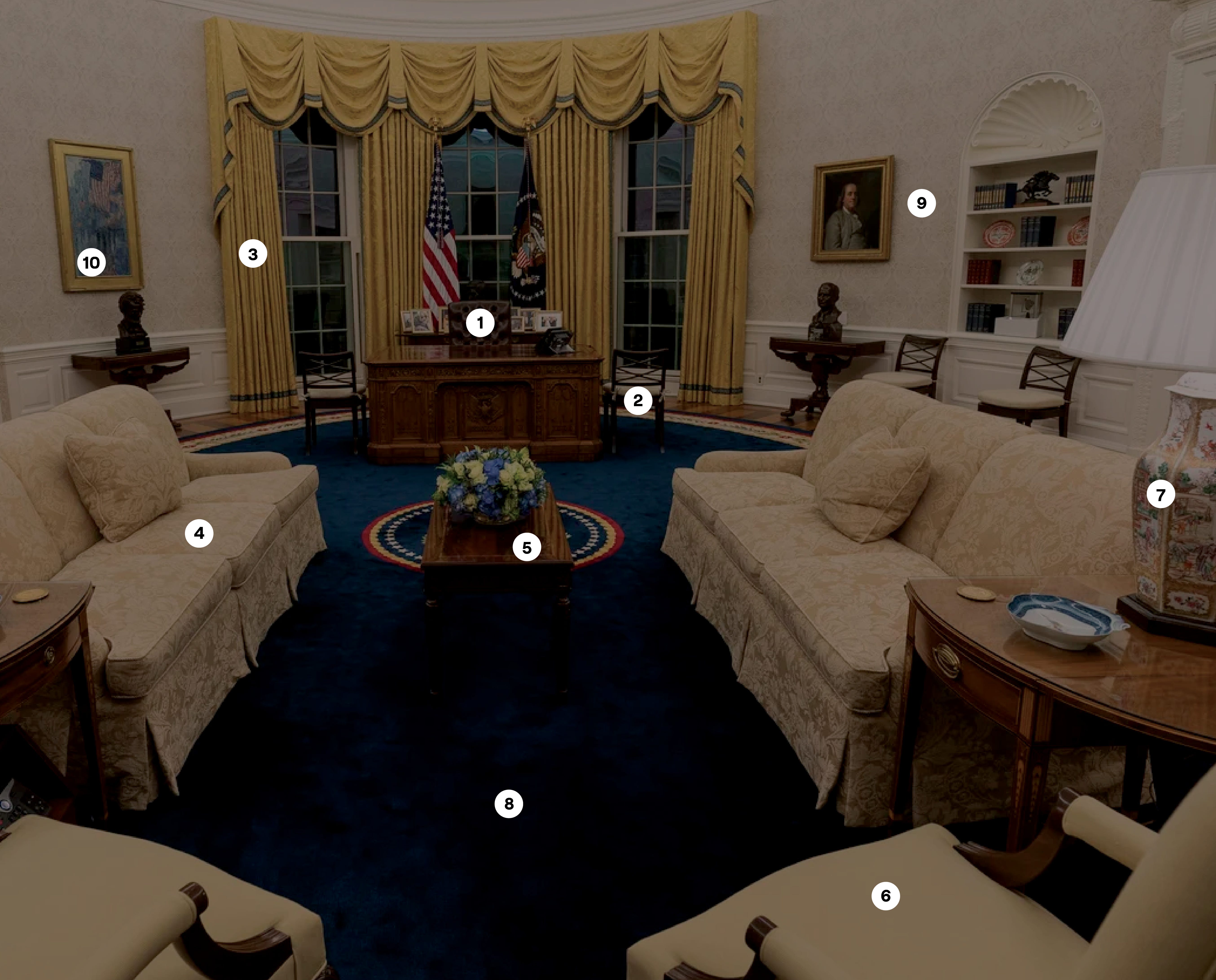
1. Desk Chair
2. Side Chairs
3. Window Treatments
4. Sofas
5. Tables & Casework
6. Armchairs
7. Lighting
8. Carpet
9. Wall Treatments & Paint
10. Artwork
1. The Desk Chair
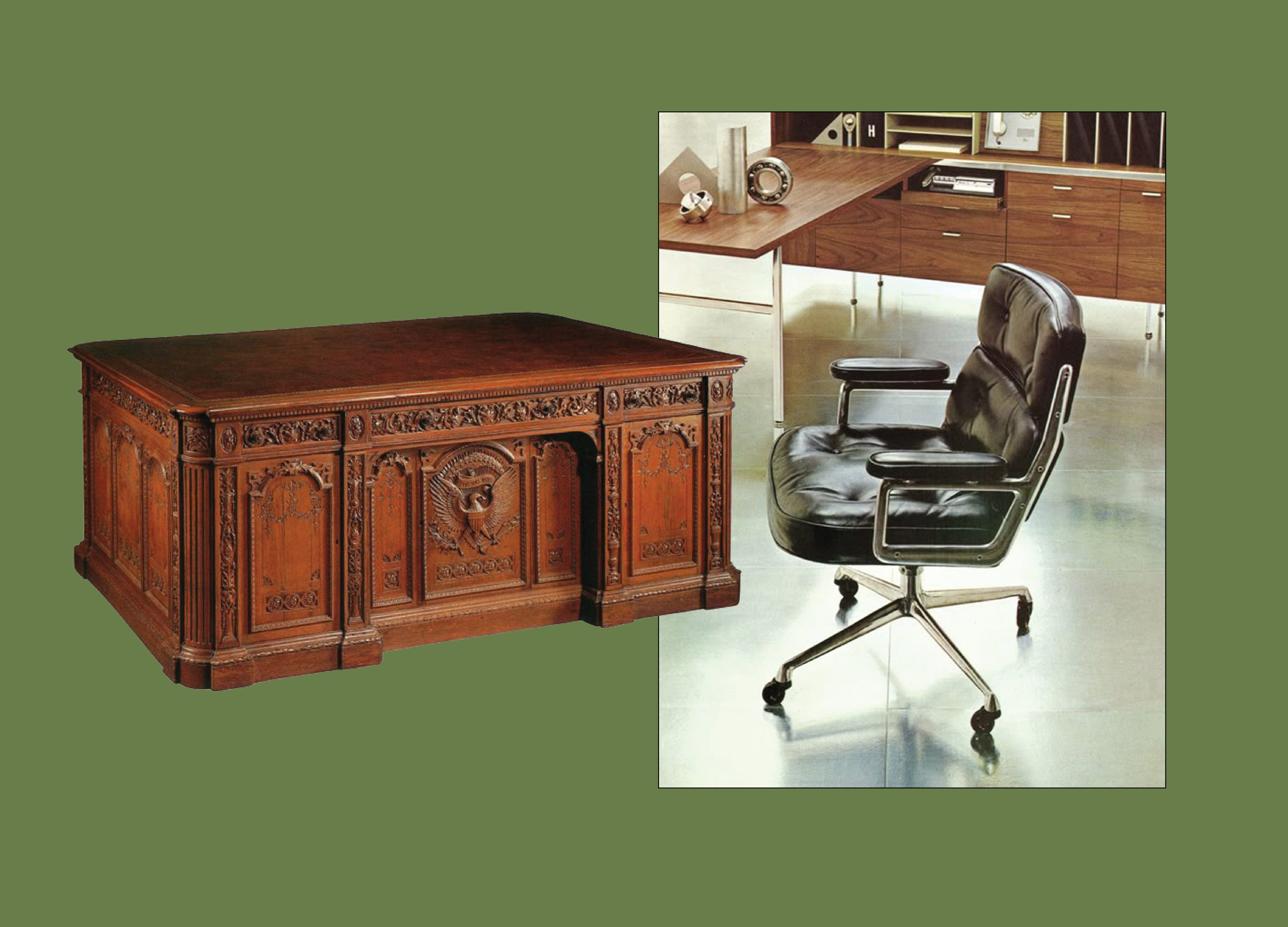
When thinking about a chair worthy of sitting behind the Resolute Desk, very few options feel grand enough to meet the moment. Most are either too traditional, too bland, or too self-important. But for this redesign, choosing a piece by one of the most accomplished American furniture designers, Charles and Ray Eames, felt exactly right. The Time-Life Chair, originally created for the executive floor of the Time-Life Building in New York, has the presence and quiet authority the room needs. It introduces the first deliberate juxtaposition in the space: the intricate, historic weight of the Resolute Desk paired with a sleek, modern American classic. The contrast is not accidental. It sets the tone for a room that respects history without being trapped by it.
2. Side Chairs
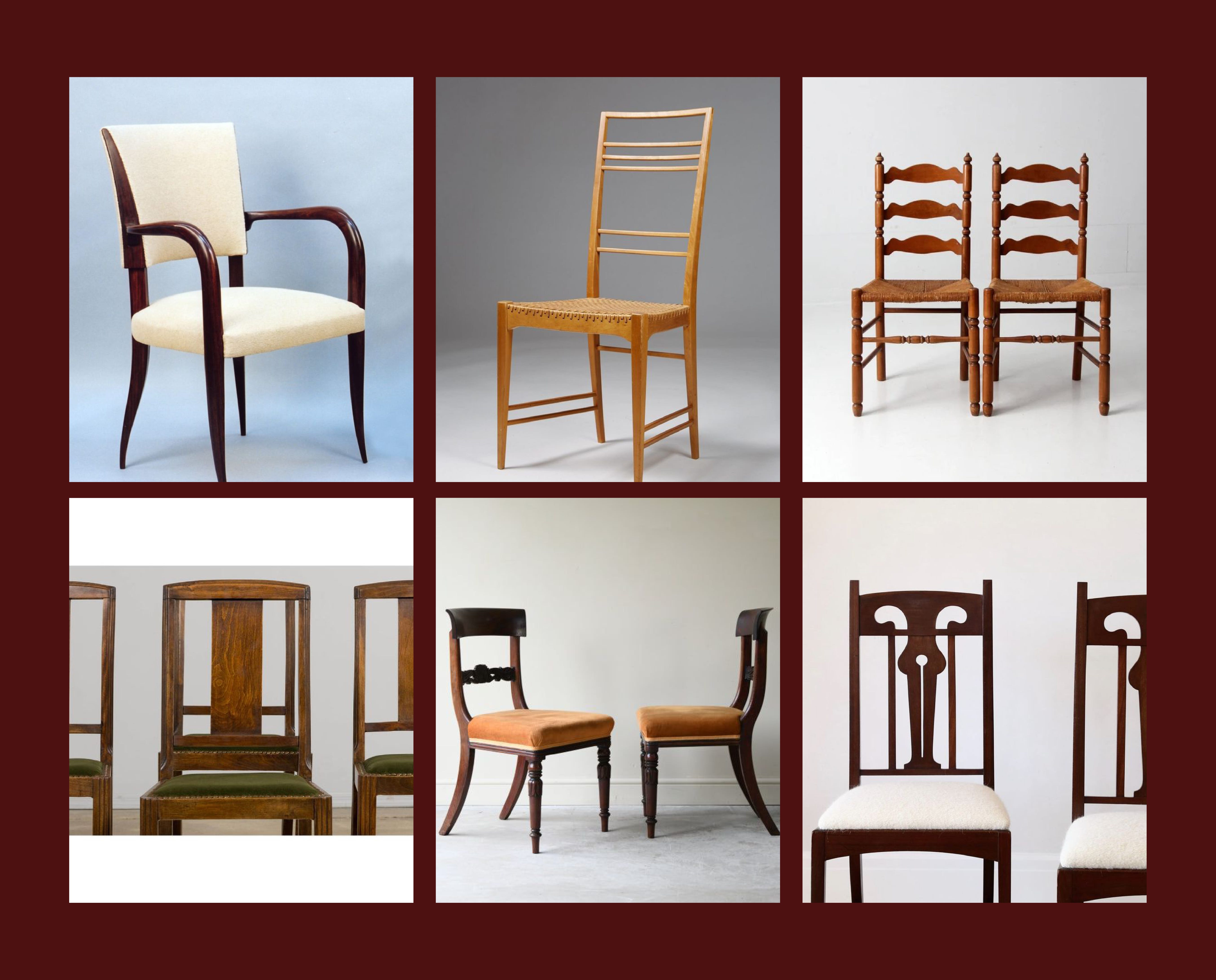
Extra seating is essential, but the last thing the Oval Office needs is a matching lineup of bland chairs that could have been ordered in bulk for a 1980s dining room set. The chairs I’m referencing here show a very different approach: shapes from different periods, silhouettes with character, and materials that bring warmth rather than corporate stiffness. Each one has its own presence, almost like a distinct point of view. That’s the kind of visual language the Oval Office deserves. A collection of chairs like these can act as a reminder that the room is meant to hold many perspectives, not only one. Mixing forms, woods, and upholstery creates a seating arrangement that mirrors what American democracy tries to be: varied, imperfect, and always building something stronger out of different voices coming together.
3. Window Treatments
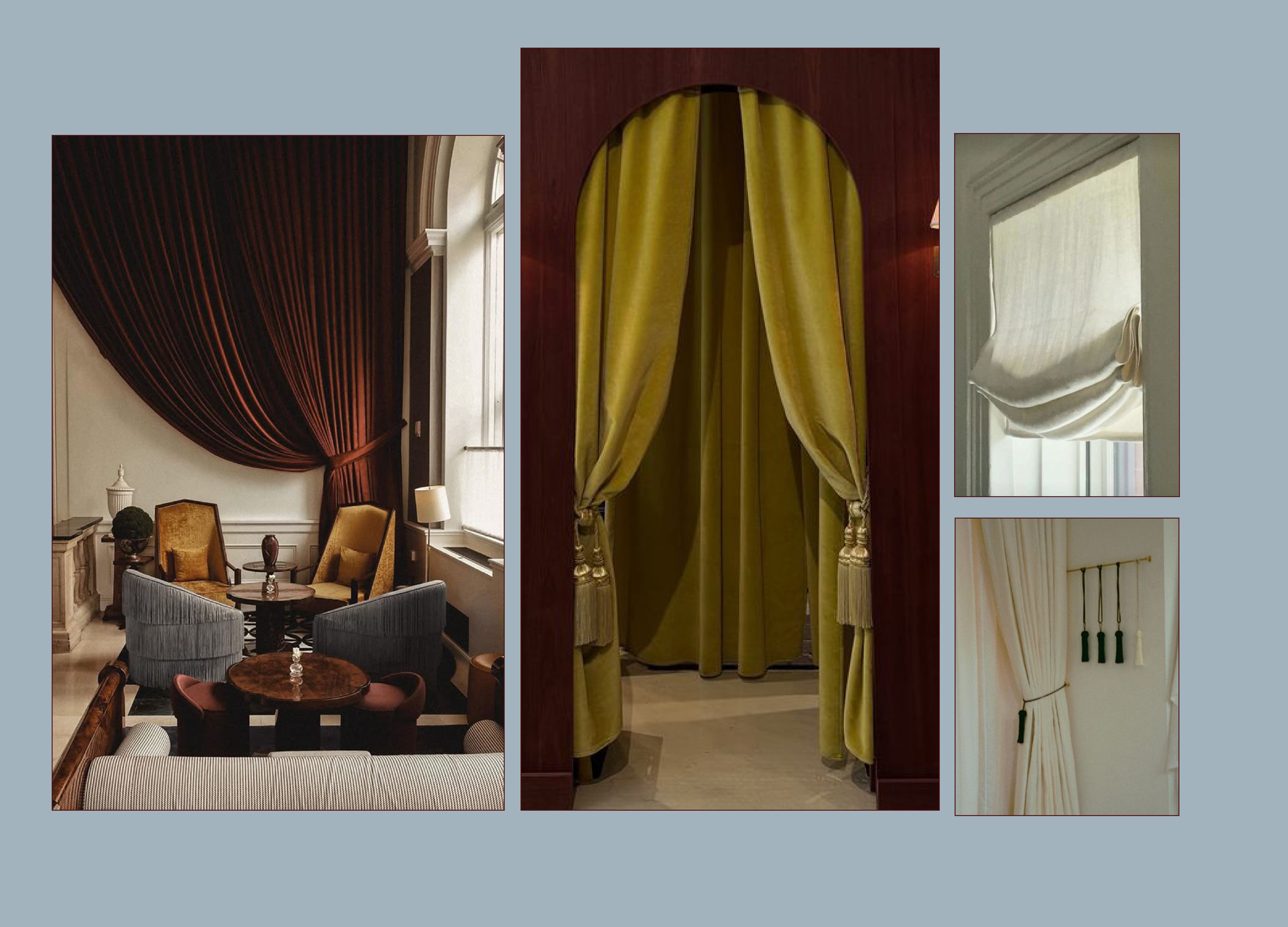
The window treatments in most Oval Offices are always the worst offenders. Must we really treat a swagged valance like a matter of national security? The heavy, overstuffed drapery has been repeated for so long that no one seems to question why the room needs to resemble a banquet hall from a past century. The images here show exactly the direction I’d rather see: drapery with presence but not suffocation, fabric that drapes with intention instead of bulk, and tassels that feel sculptural rather than fussy. A single, oversized tassel like the ones shown could be a subtle homage to the ones that drape off the American flag, offering ceremony without theatrics. And even a simple roman shade, softly pleated and quietly elegant, would be a vast improvement. These references prove that formality does not require excess. The Oval Office could easily hold a look that respects history while embracing a lighter, more modern expression of it.
4. Sofas
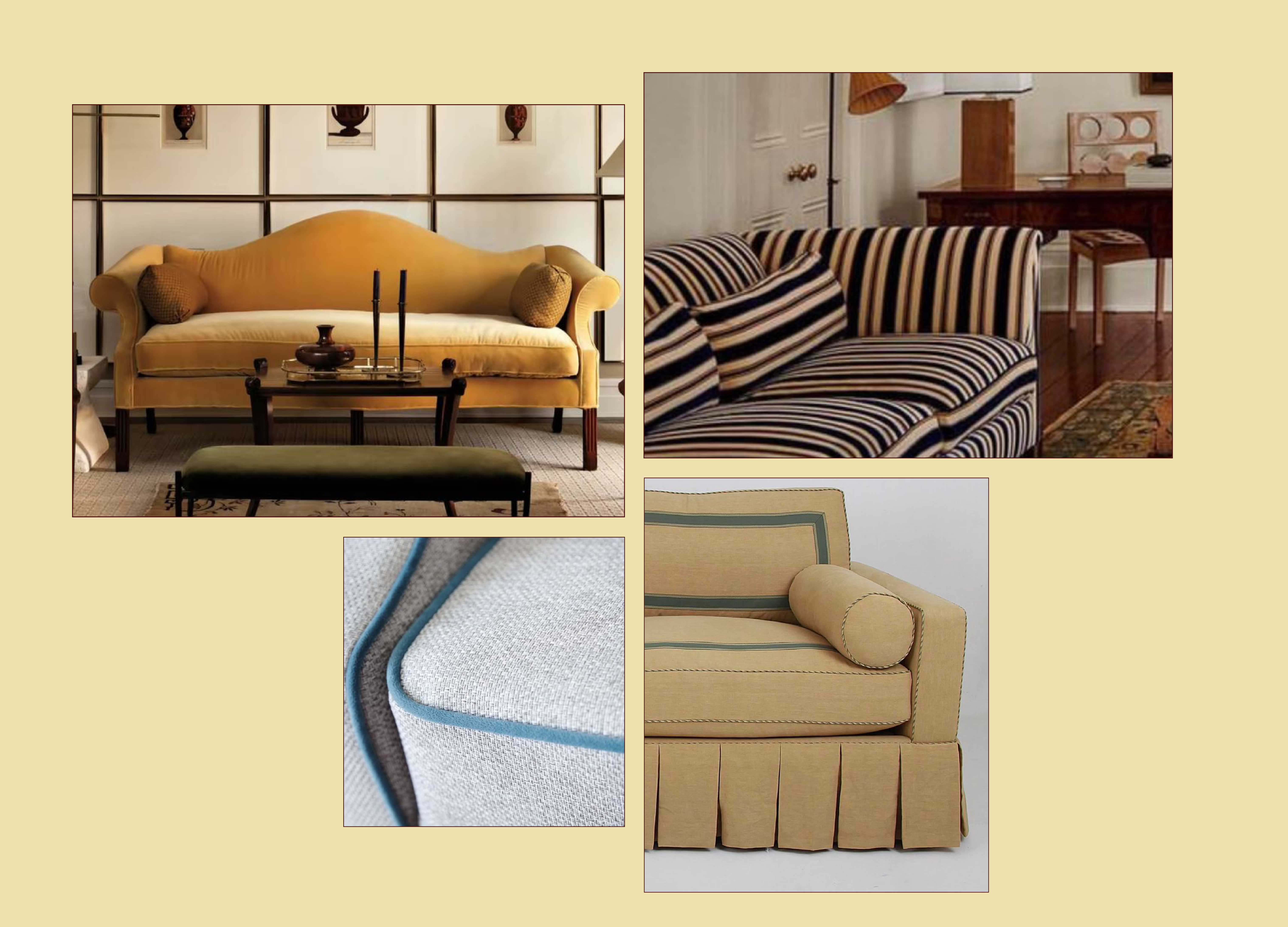
The sofas I’m referencing bring together exactly the mix of eras and geometry I want for the Oval Office. The yellow camelback silhouette offers a historical nod without feeling dated, thanks to its clean lines and unfussy profile. The striped piece brings in that crisp, almost nautical geometry that could easily be adapted into a subtle flag-inspired motif. And the pale upholstery with bold blue piping shows how a simple color shift can feel both fresh and deeply American without becoming literal. Even the pleated skirt on the last sofa has a tailored grace that feels right for a room of this scale. Together, these pieces show how the sofa can bridge tradition and modernity, offering pattern, structure, and symbolism without falling into the overdone filigree trap of past administrations.
5. Tables and Wardrobes
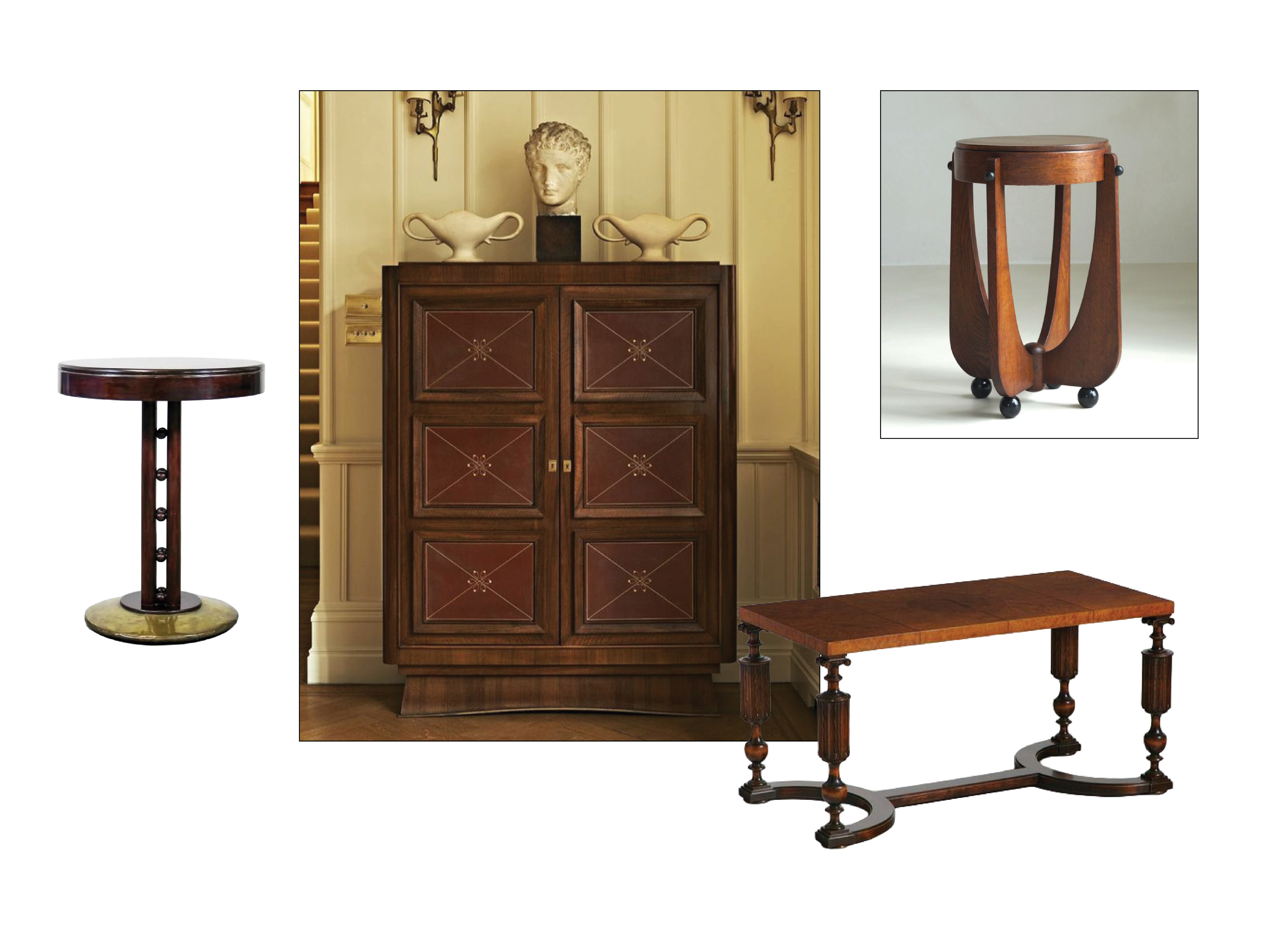
A collection of tables and casework with sculptural lines and rich wood tones. These pieces bring warmth, craftsmanship, and dimension to the room, offering functional surfaces that feel both historical and fresh without tipping into heaviness or ornament for ornament’s sake.
6. Armchairs
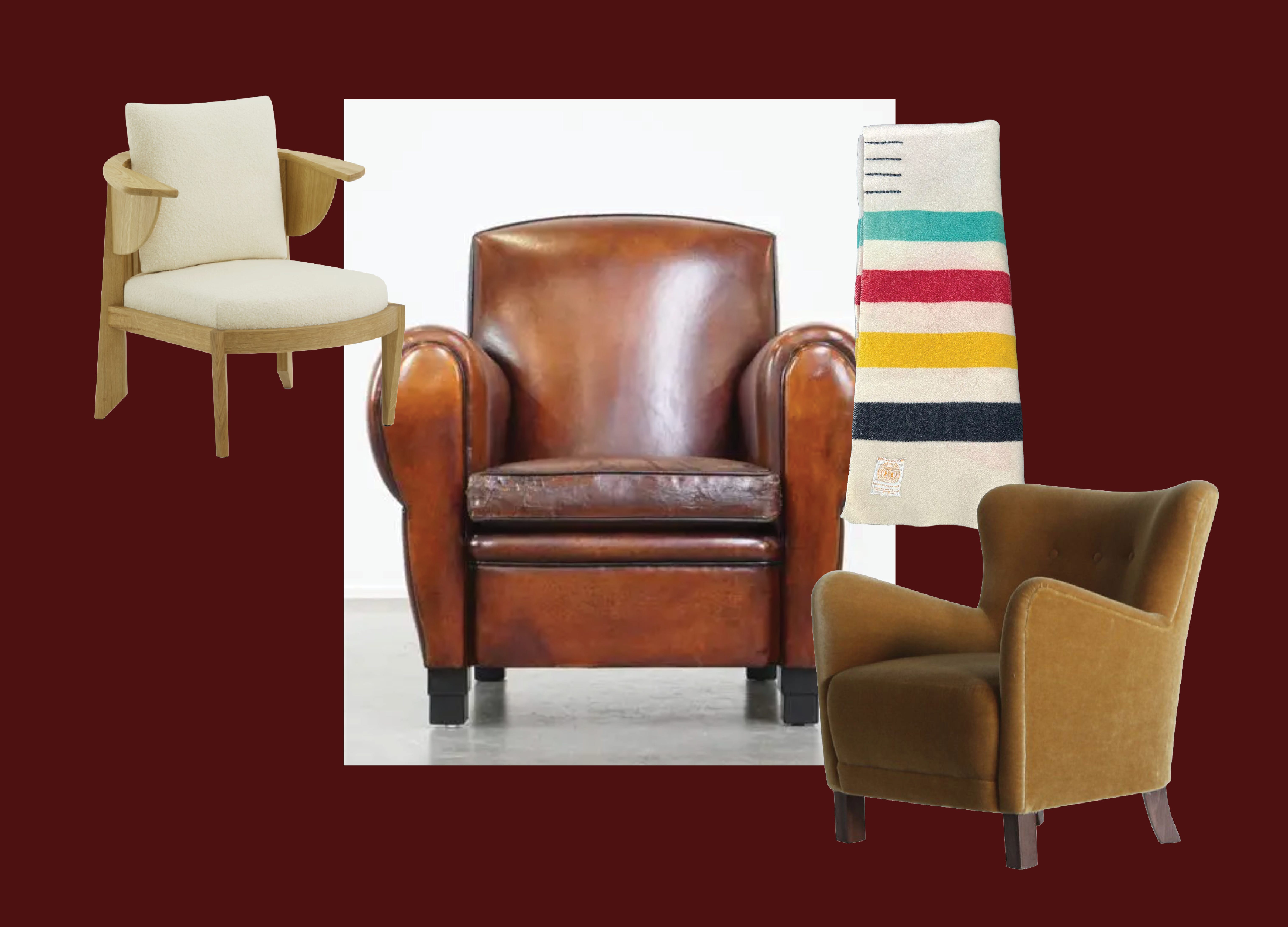
Focusing on smaller armchairs to flank the fireplace brings softness without crowding the room. Each of these chairs has a classic profile and a modest footprint, offering comfort without unnecessary bulk. Draping a traditional American Pendleton blanket over one adds warmth and texture, a quiet nod to craftsmanship and heritage without feeling overly symbolic.
7. Lighting
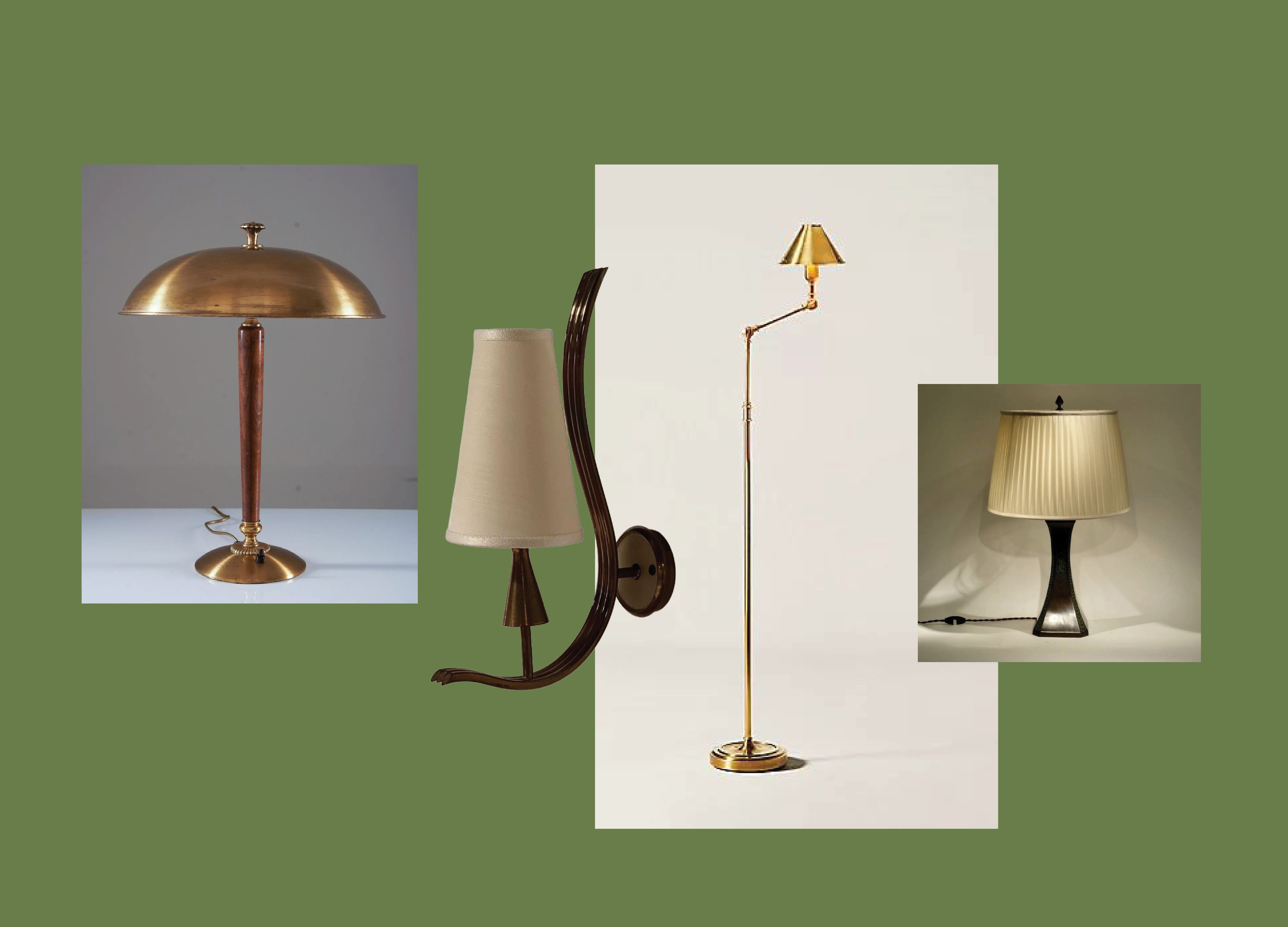
A mix of sculptural lamps and sconces in warm metals and soft shades. These silhouettes bring atmosphere without visual mass, adding quiet elegance and gentle light that supports the room’s warmth rather than overwhelming it.
8. Carpet
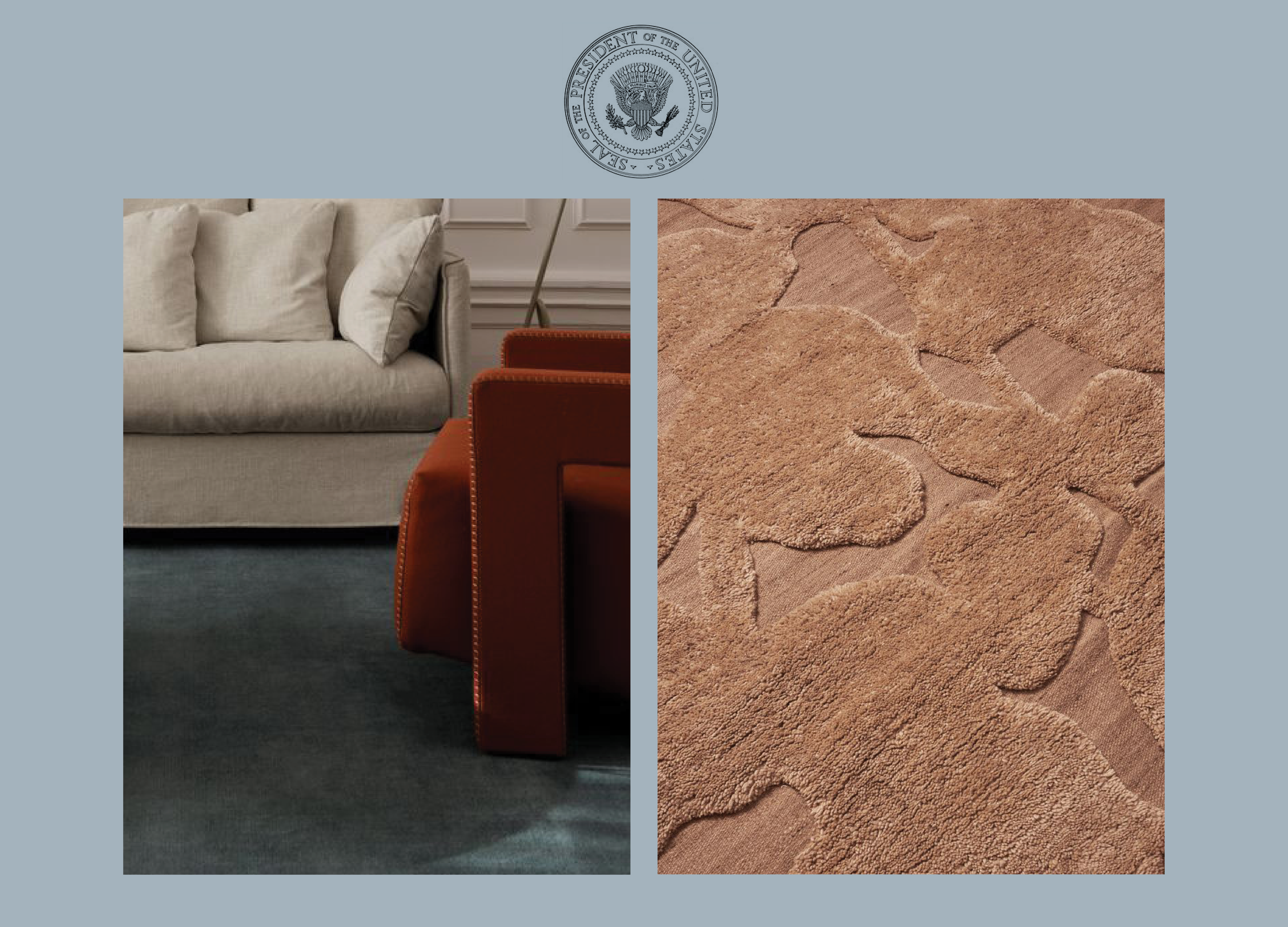
The Oval Office carpet almost always features a full-color version of the presidential seal, which can feel overly literal. I would rather take a more subtle approach by translating the seal into a tonal relief. The symbol would still be present and respectful, but it would read as texture instead of illustration. This creates a quieter, more sophisticated surface that allows the room’s furnishings and architecture to breathe while still honoring the office’s history.
9. Wall Treatments and Paint
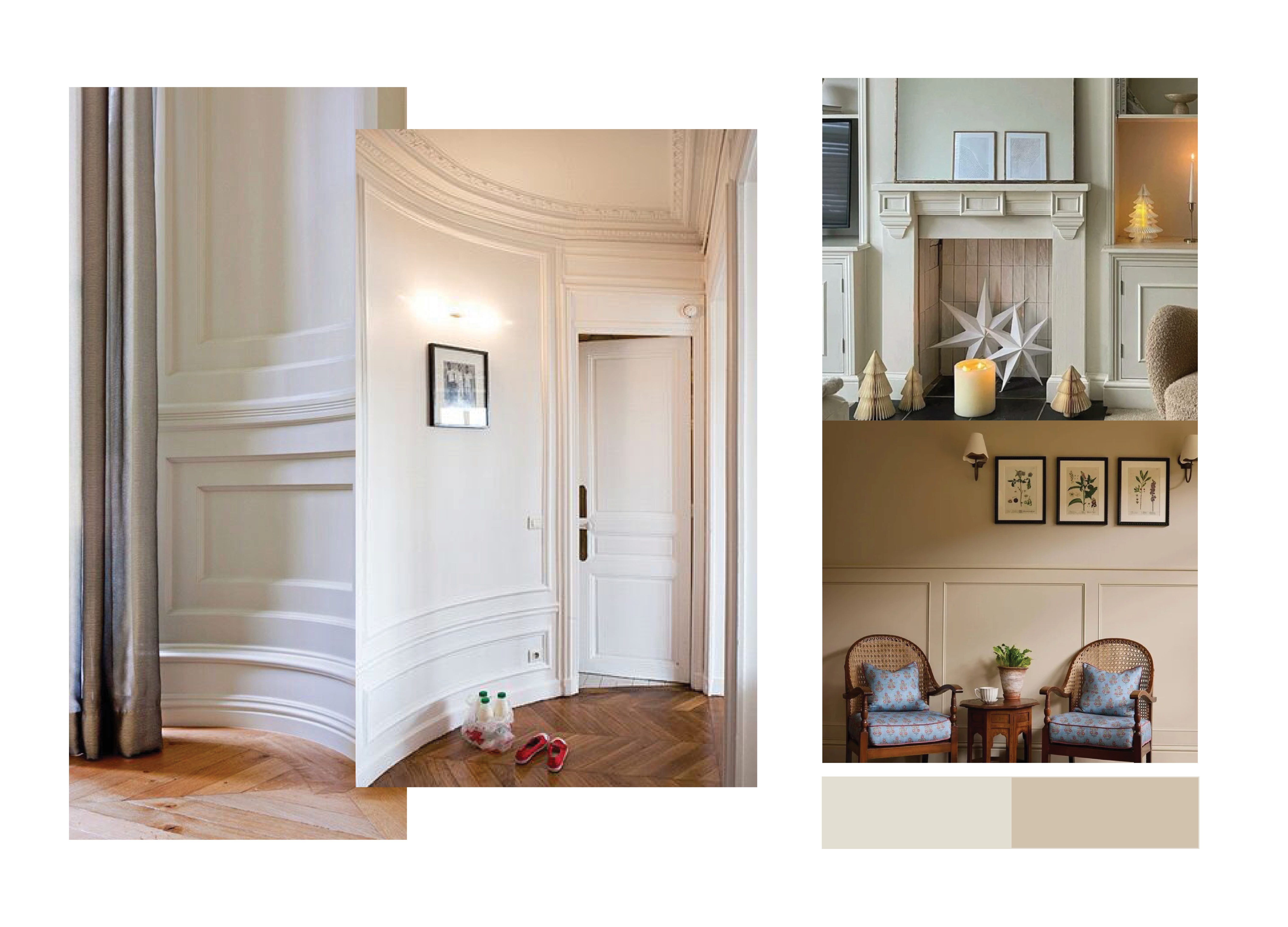
The filigree wallpapers of Oval Offices past have done enough damage. Rather than more pattern, a simple picture molding would let the artwork shine and still feel period-appropriate. Paired with two soft neutrals like Farrow & Ball’s School House White and Oxford Stone, the walls could finally feel calm, refined, and free of all that visual noise.
10. Artwork
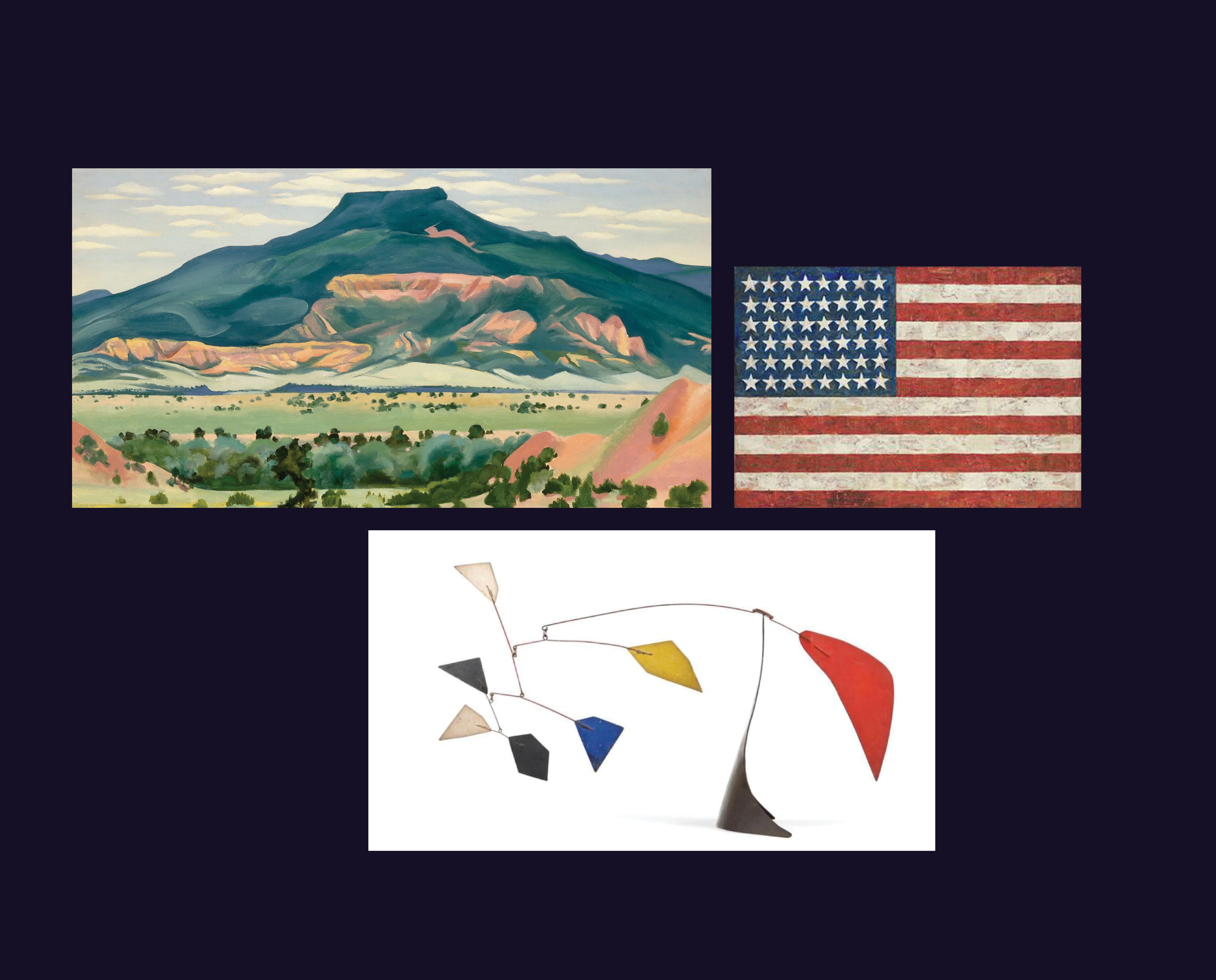
I would want to celebrate American artists in a way that feels expansive, not predictable. Sculptures, landscapes, and even reinterpretations of the flag can live together and tell a fuller story of the country, its place, its people, and its evolving identity.
Extra Credit: Typography and Signage
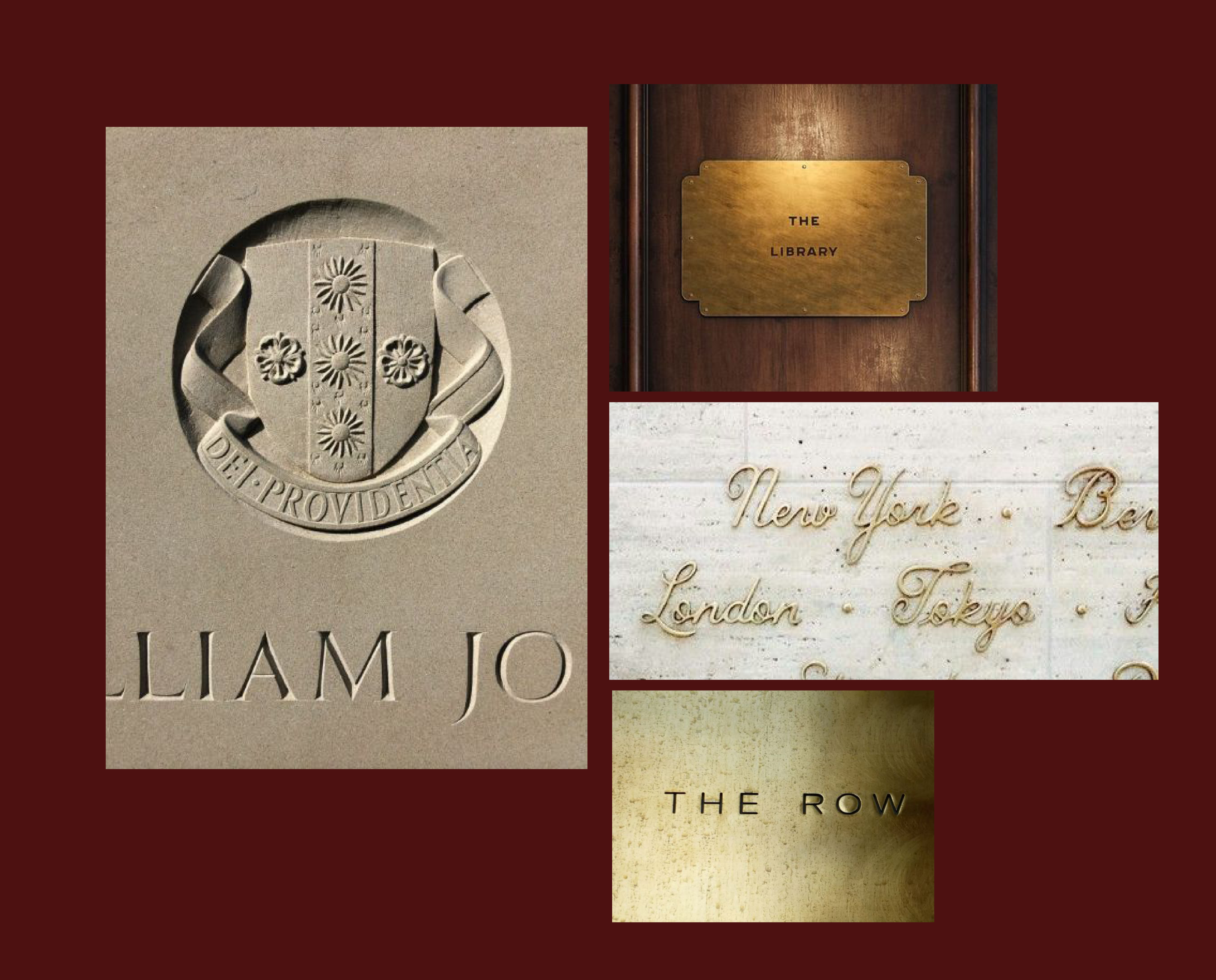
Signage is where the whole visual identity has completely collapsed under the most recent administration. We are drowning in bright gold type and makeshift notices that look like they were whipped up five minutes before a middle-school bake sale. It is chaotic, cheap, and embarrassing for a place that is supposed to project stability. The White House deserves better than whatever this is. We should return to a time when type had dignity and room to breathe. Engraved stone. Unlacquered brass. Hand-crafted lettering that actually belongs on a historic building rather than printouts curling at the edges. It is not complicated. It is simply respect for design.
Maybe one day we’ll get the Oval Office we deserve. Until then, consider this my patriotic act: giving the room a makeover it didn’t ask for but absolutely needs.
Molly, I love this! I’m so glad I found you.
Amen to all! Well planned out and such good food for thought! I like it very much but especially the Typography and Signage - which would have deeply appealed to your Uncle Thomas. Who are the artists: the first reminds me of Page but I don't think it is... and not Calder...??